Wear the word.
Carry the object.
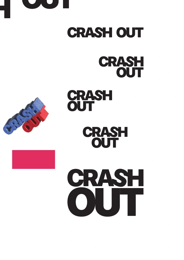
01 / WORD AS OBJECT
A name you
can hold.
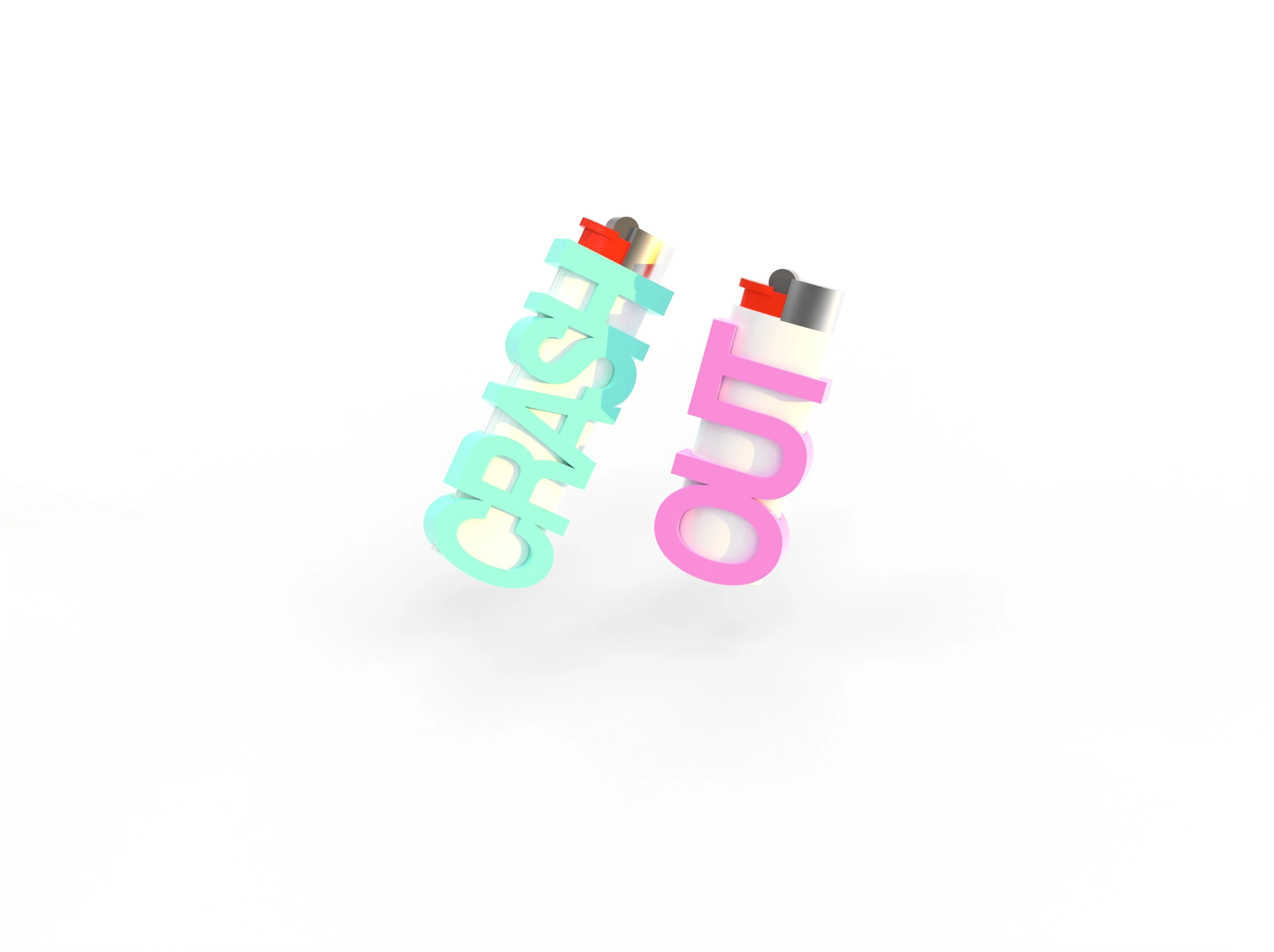
The project turns CRASH OUT from a graphic mark into a pair of small objects. The words become thick, continuous forms that sit around a lighter, keeping the flame mechanism exposed above the letters.
Typography does two jobs at once: it carries the identity and gives the case its shape.
Colour study / purple + pink
TYPE HAS
THICKNESS.
02 / FROM LETTERS TO VOLUME
Extrude.
Connect.
Carry.
The modelling files develop the words as solid, connected pieces. Open letter counters, an elongated cavity and a small attachment loop become part of the same geometry.
The forms below are views generated directly from the project’s original model files, making the object’s depth and openings visible.
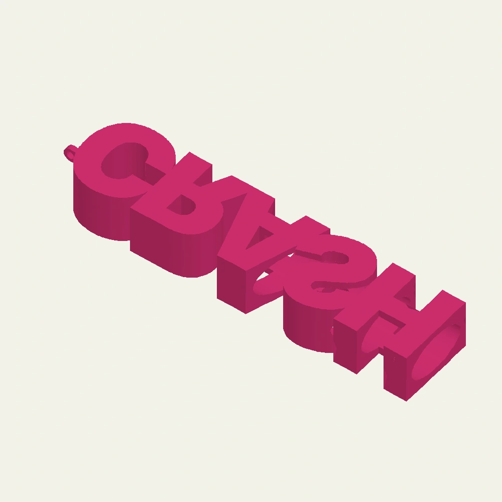
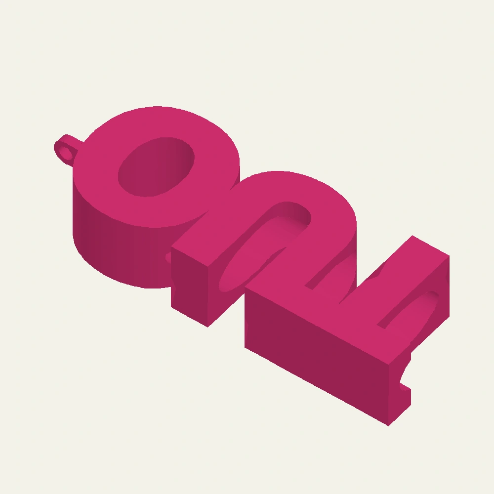
CAD views use a uniform display colour for clarity. The archive contains size variants and model files; these do not establish fit, heat resistance or production readiness.
From the model archive
One word.
More than one view.
A further case study makes the depth legible. The face view keeps the word intact; the angled view exposes the volume behind it.
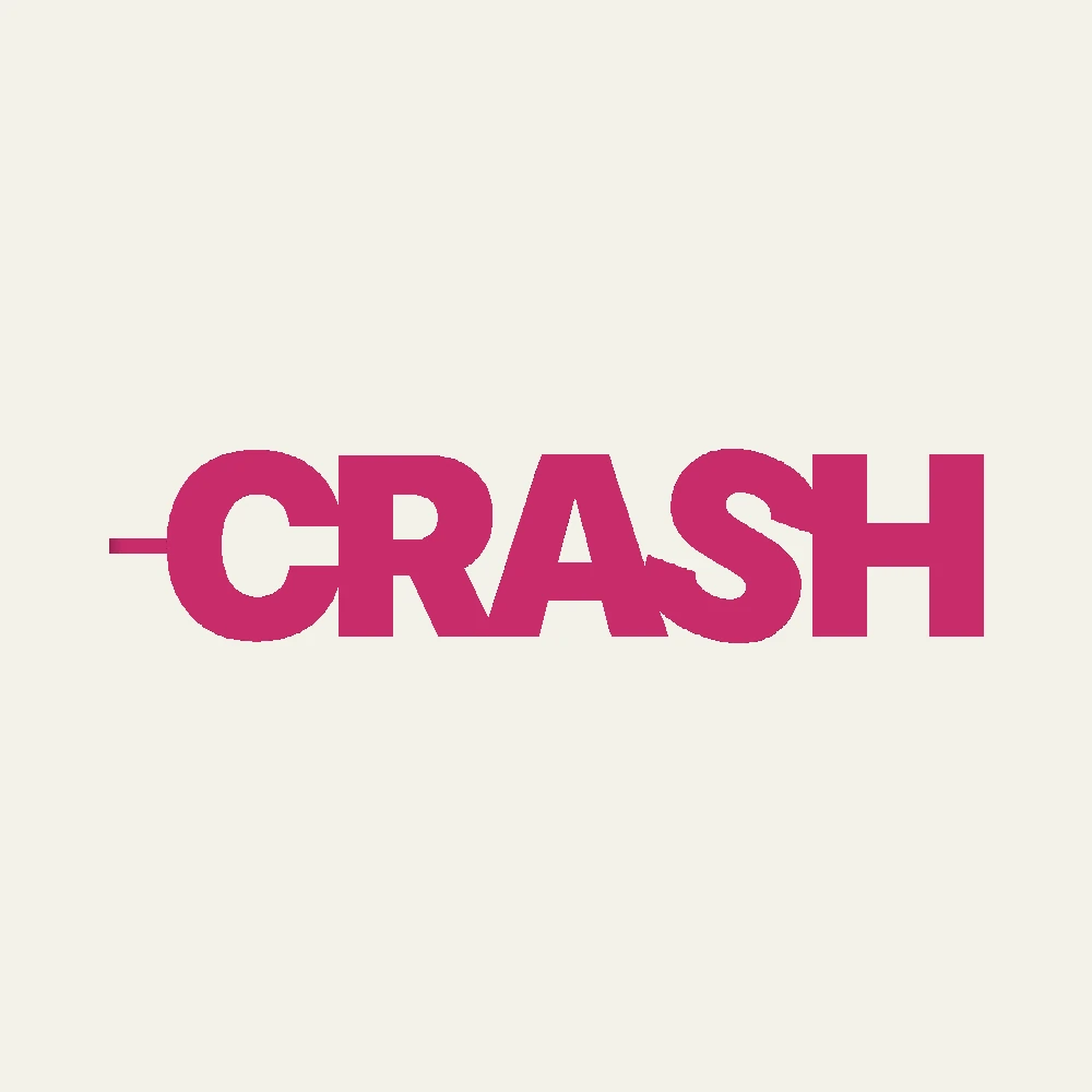
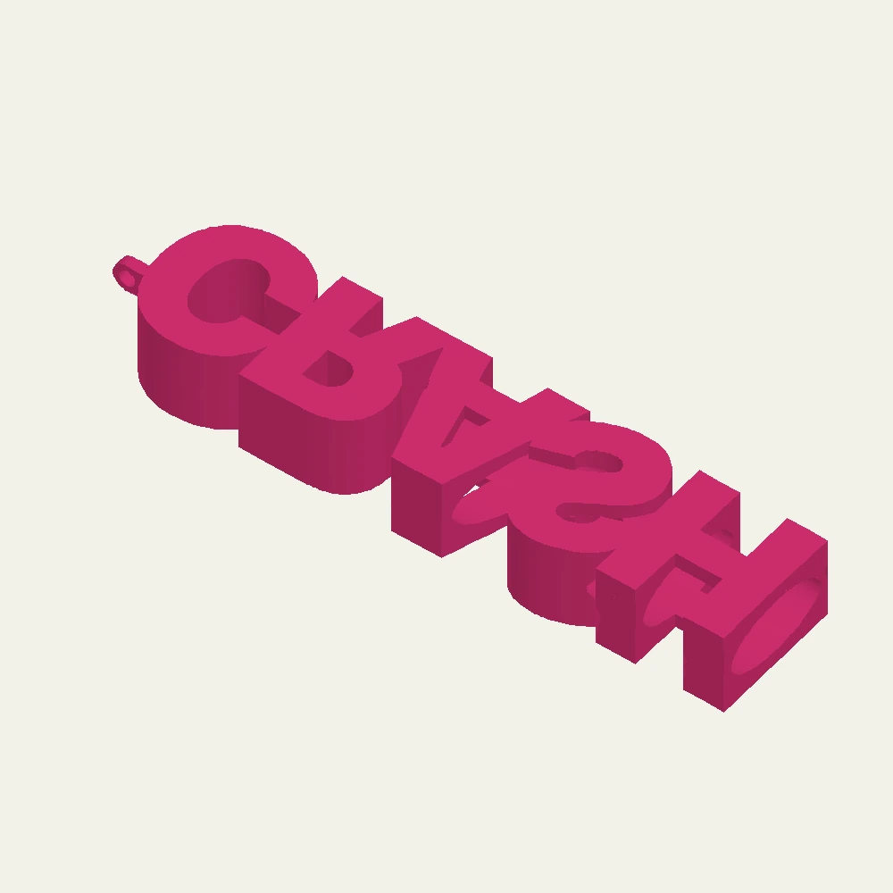
Views generated from the original CAD geometry. Display colour is used for readability.
03 / COLOUR DOES THE TALKING
Two words.
Boxed together.
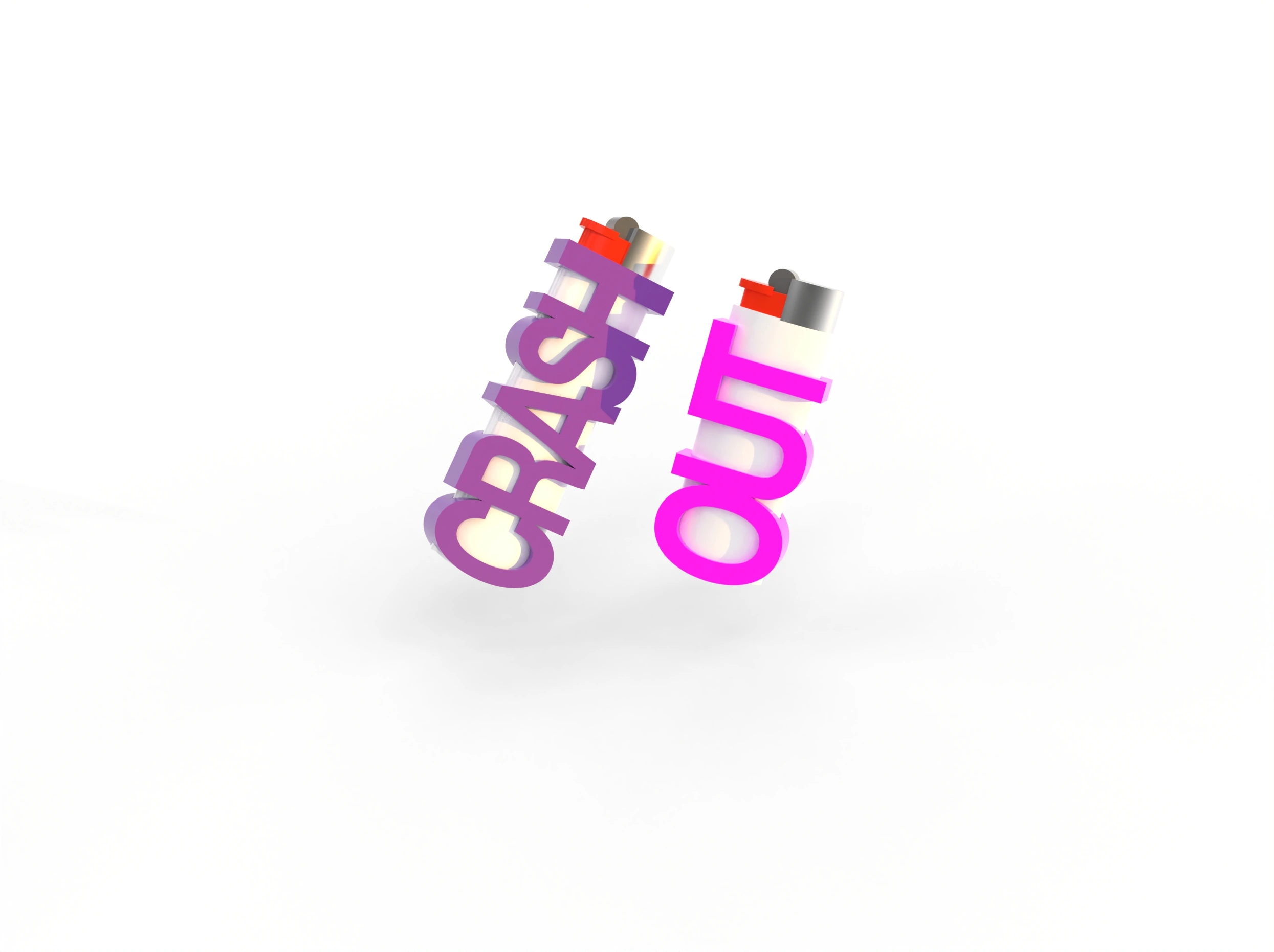
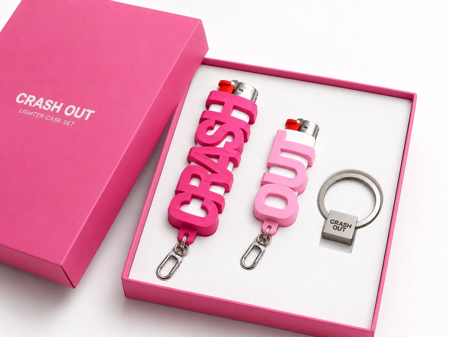
The finished-set visualisations bring the cases, carrying clips and key ring together in a fitted presentation box. Pink and purple give the same letterforms two different moods.
04 / AN IDENTITY IN THE HAND
The lettering
is the case.
Open at the top
The lighter’s metal head remains visible, extending the object above the letterform.
Connected as one
Extruded letters meet to form a single elongated body, rather than separate loose characters.
A point to attach
The CAD geometry includes a small loop at one end, adding a way to connect the case to carrying hardware.
Concept record: original identity sheet, colour and packaging visualisations, and digital geometry. CRASH OUT is shown as a design exploration.