Pinked.
A small shell.
A whole working world.
A tattoo artist’s studio explored through a container, expandable rooms, built-in furniture and a black-and-pink identity.
More than a
tattoo chair.
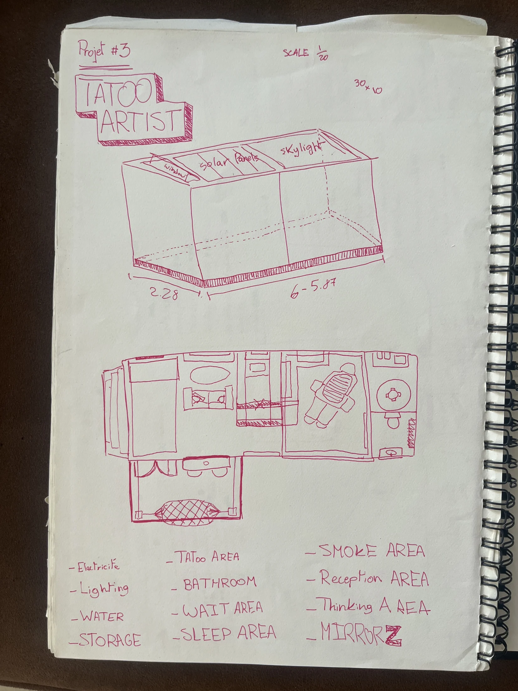
The notebook begins with the needs of a tattoo artist. A place to work also needs a place to welcome someone, wait, store equipment and take a break. The early brief lists a tattoo area, reception, bathroom, waiting space, storage and rest, alongside the everyday requirements of water, light and electricity.
The challenge was to organize those activities inside a narrow container volume. Initial sketches examine a long rectangular shell, roof openings and small extensions. The compact footprint makes every surface and every change in plan part of the design problem.
Open the box.
Move the boundary.
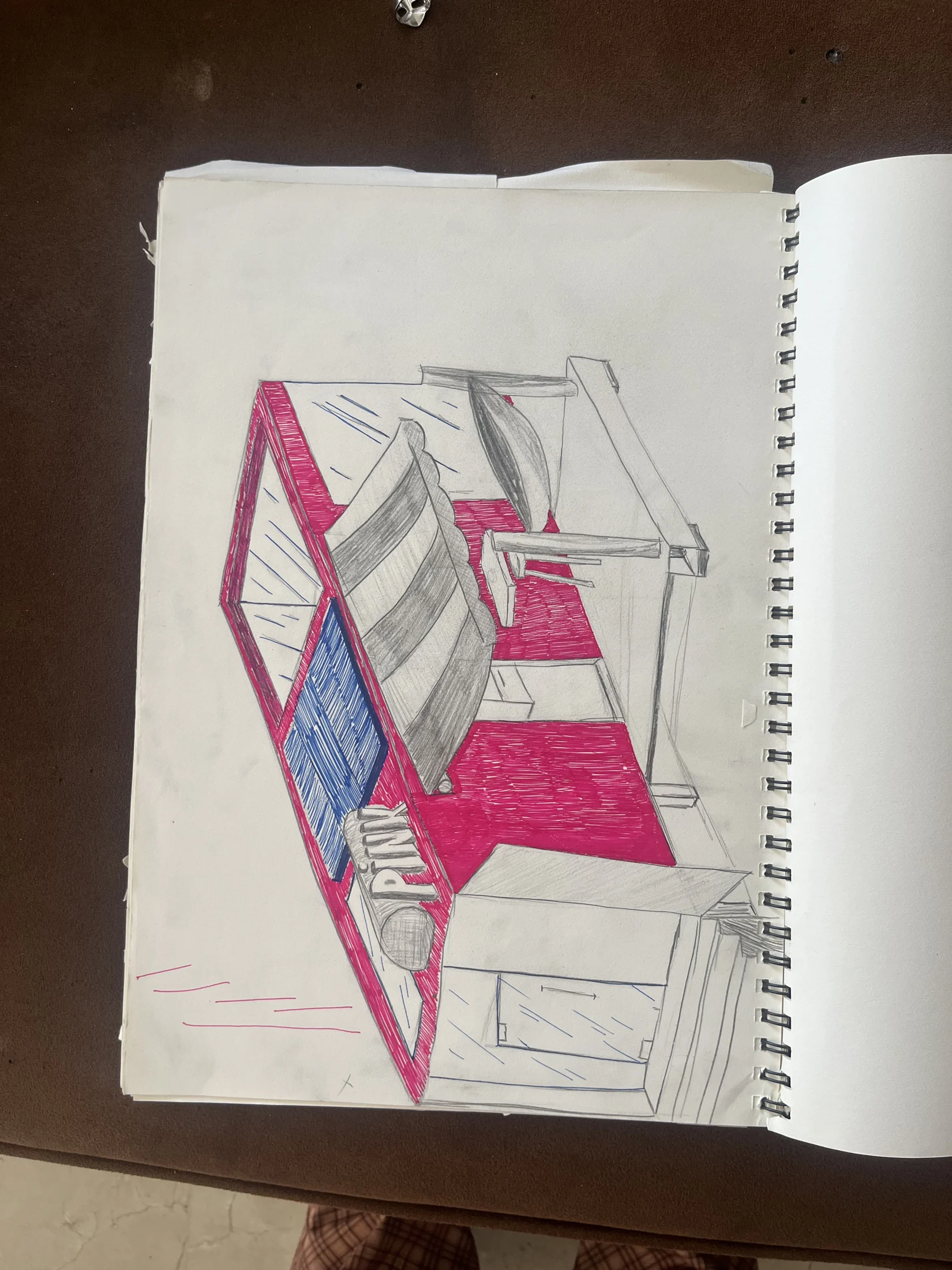
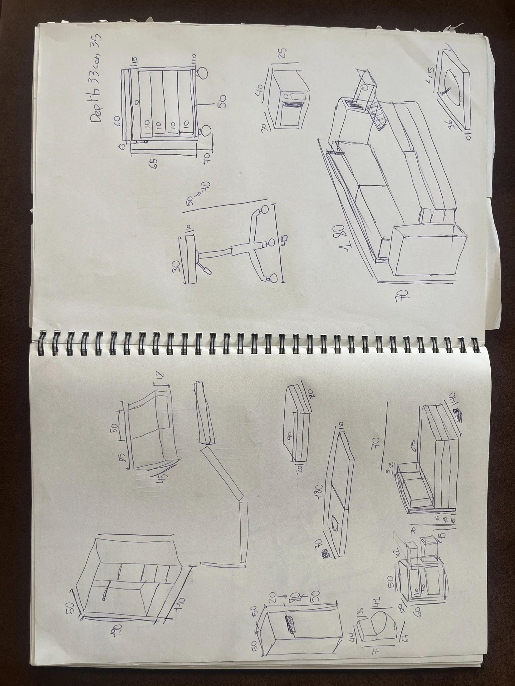
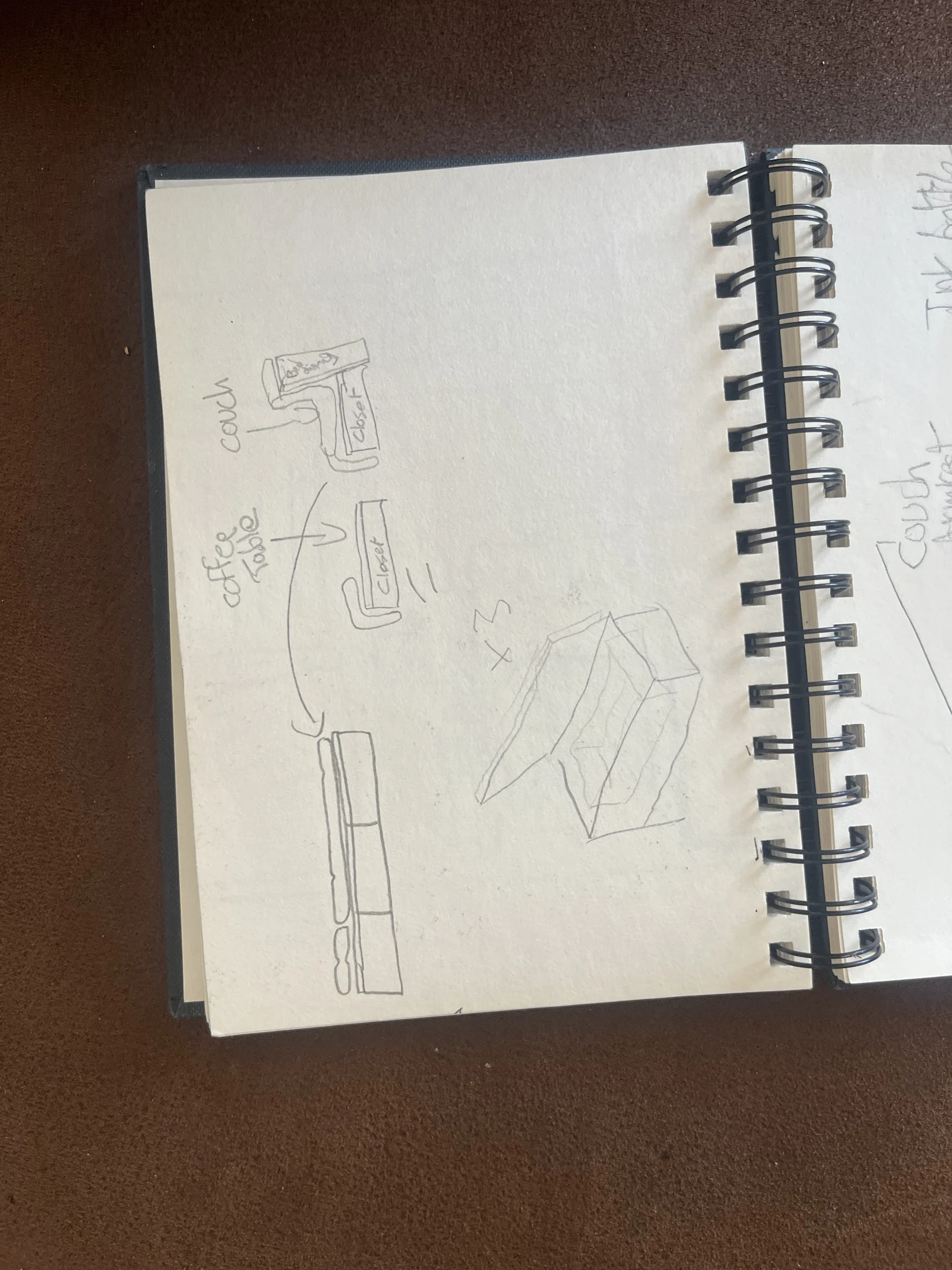
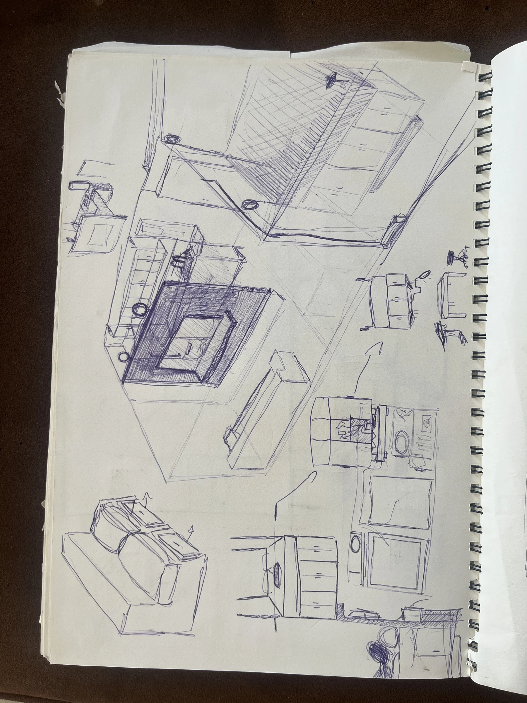
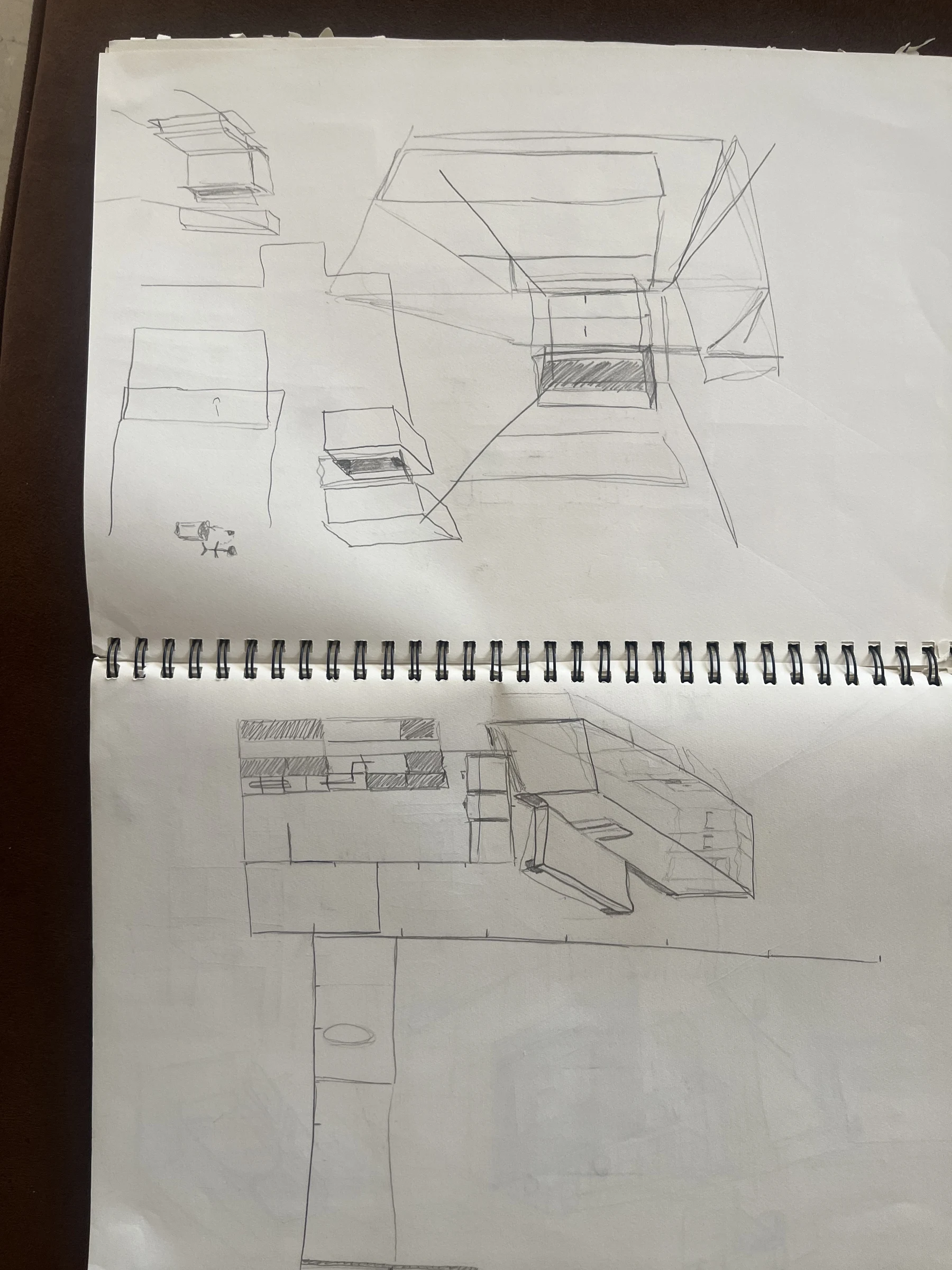
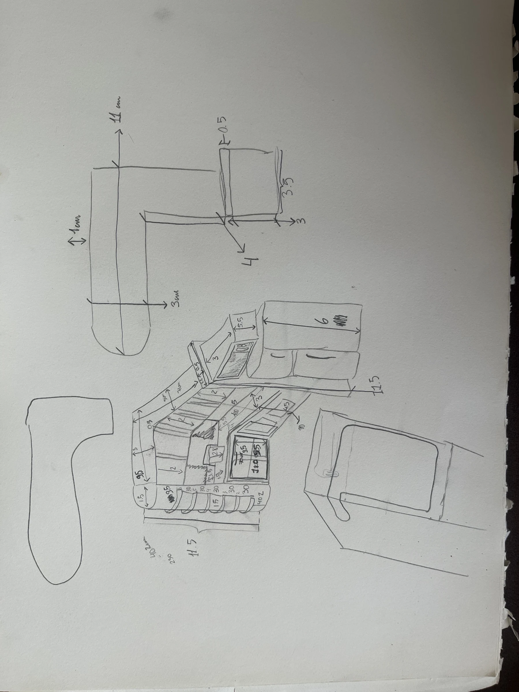
The development drawings test the container as something that can open out. Plans, perspective views and sections explore doors, side volumes, furniture and projecting elements together. The sketches move between the whole room and the details that let a small area serve more than one purpose.
Pink is present in the early drawing studies, before the polished model. It marks the studio as a distinct place within the industrial shell. Black framing and large rounded openings later give the extended volume a different character from the corrugated main body.
Room to
think on paper.
Three more pages from the development notebook: opening, arranging and fitting the space together.
One compact core.
Several directions out.
The plan changes when the studio opens.
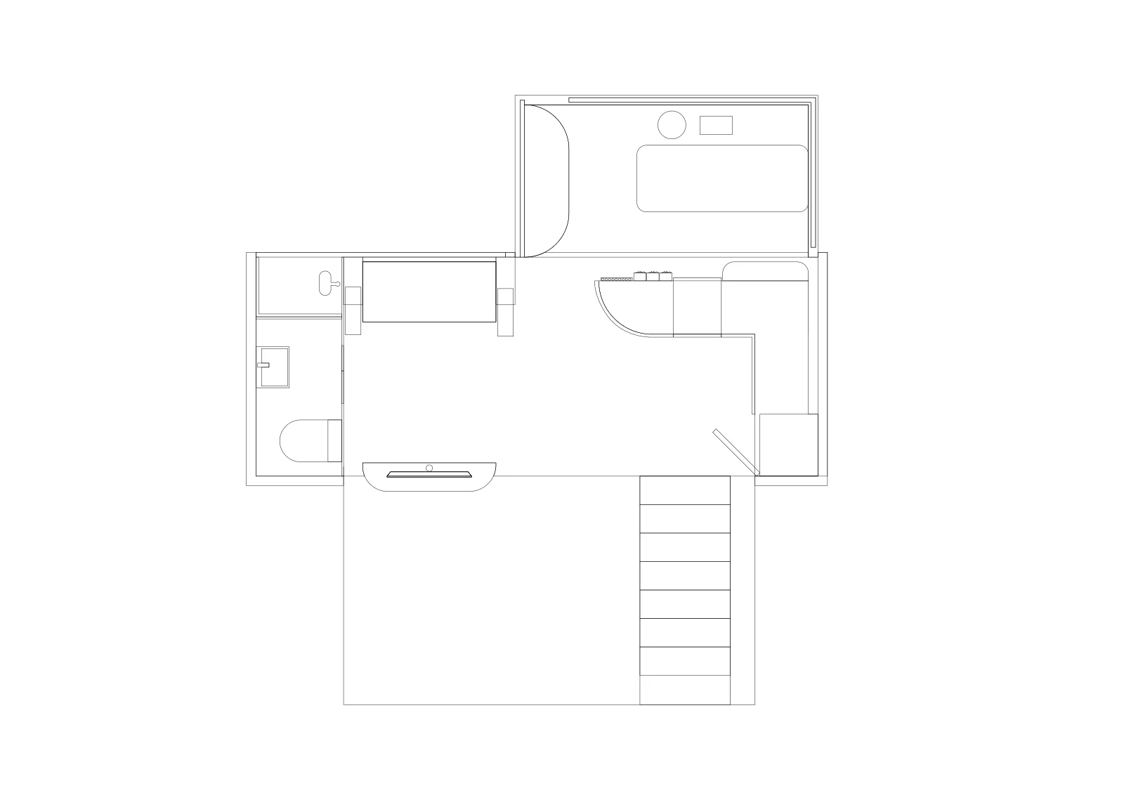
The drawing set records both the compact configuration and an expanded arrangement. The central rectangular space is supplemented by volumes on different sides, allowing the scheme to distribute functions beyond the original narrow outline. An exterior platform and stair are part of the illustrated open state.
Color in these plans is used to distinguish surfaces and zones, while the later black-and-pink model resolves the visual identity. The paired views make the spatial idea readable: a contained core, a series of extensions and a deliberate threshold between the studio and its surroundings.
One core.
More room.
The compact and expanded configurations, side by side. Slide to compare the two drawn states.
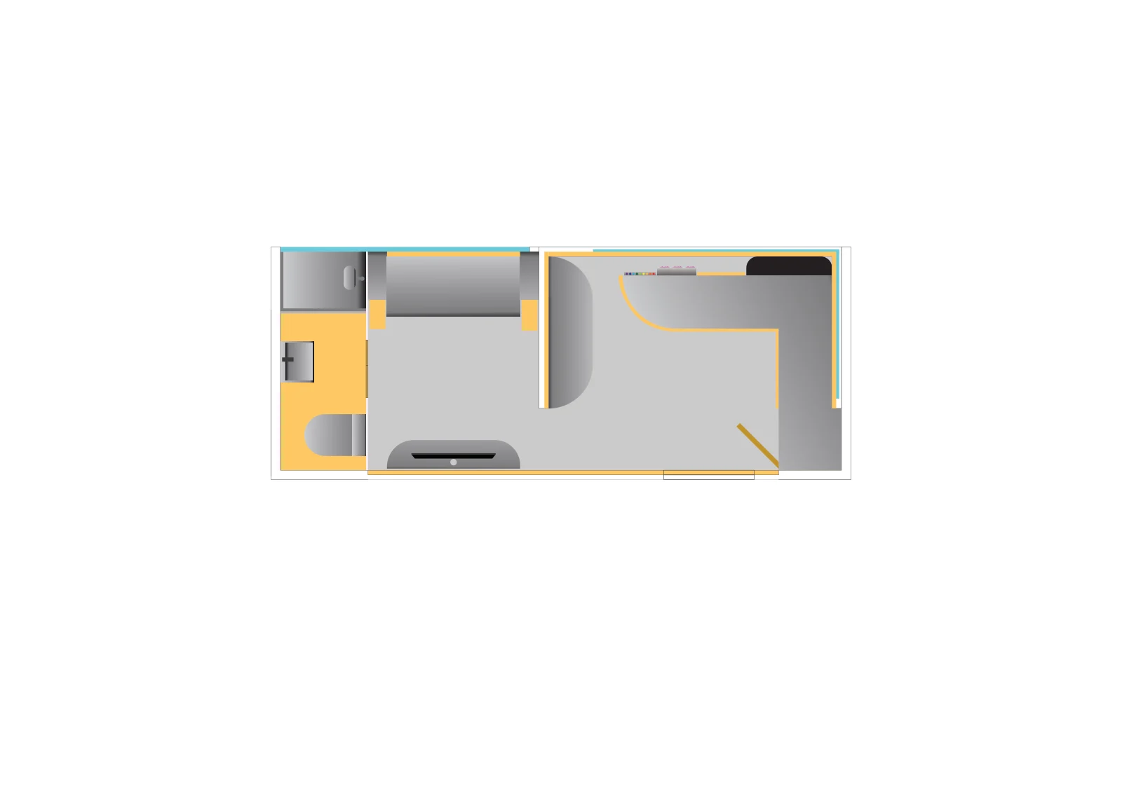
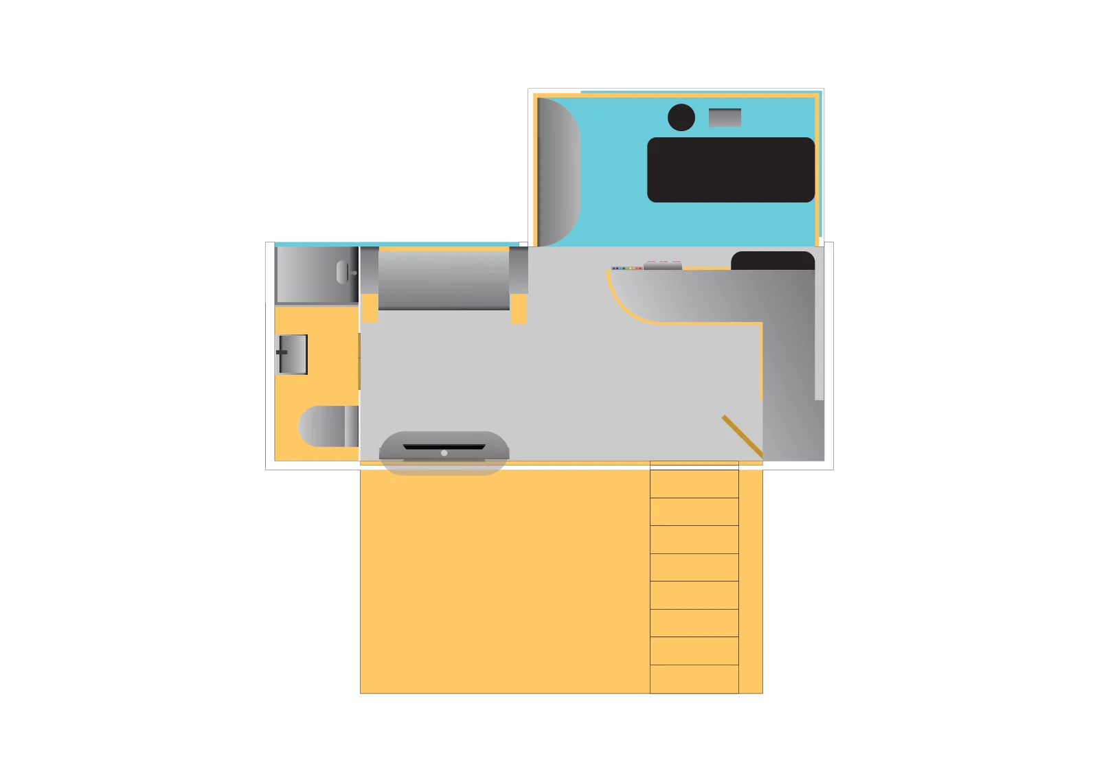
A comparison of design drawings. The transition is a viewing tool, not a simulation of the opening mechanism.
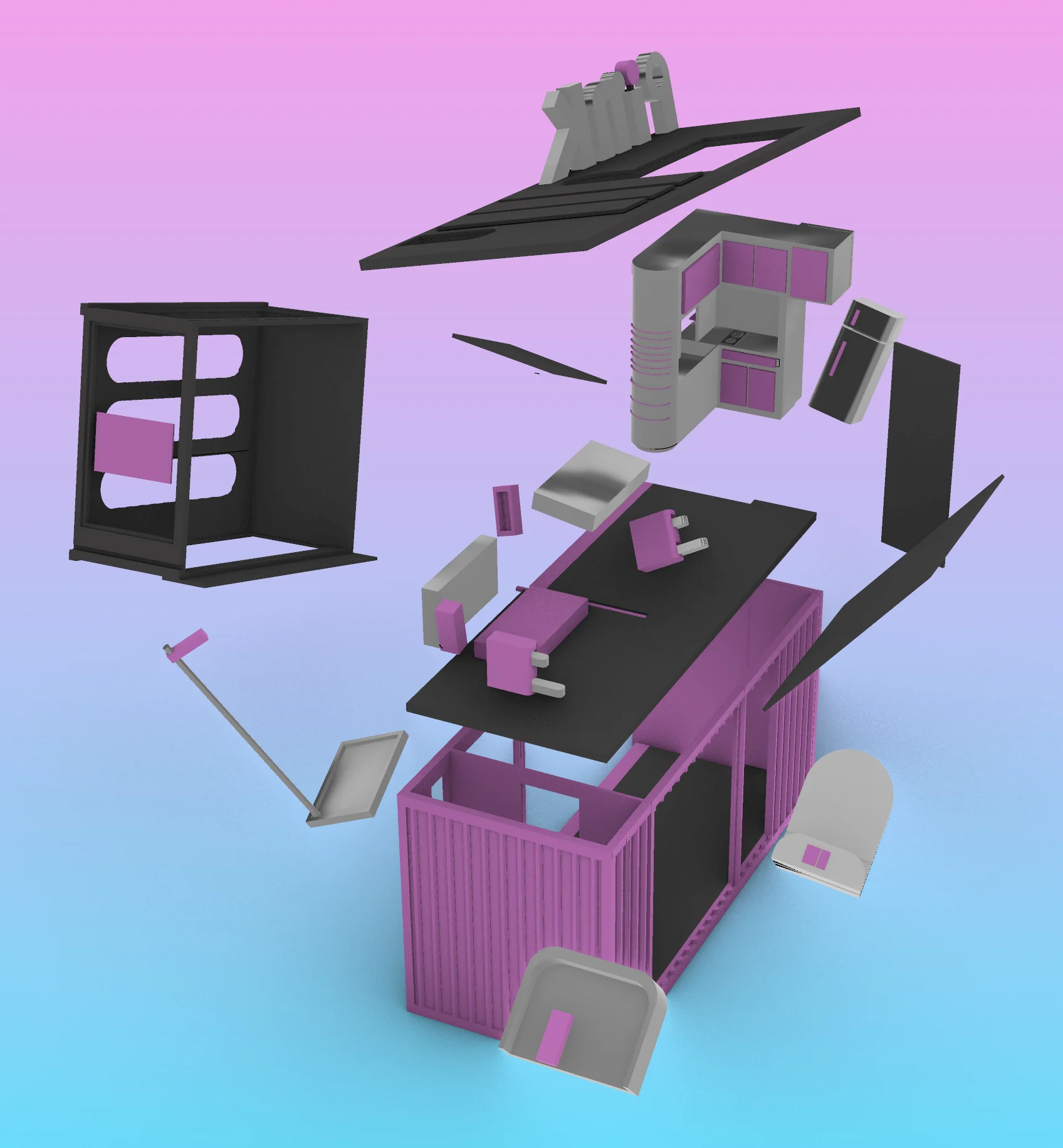
Take it apart
to understand it.
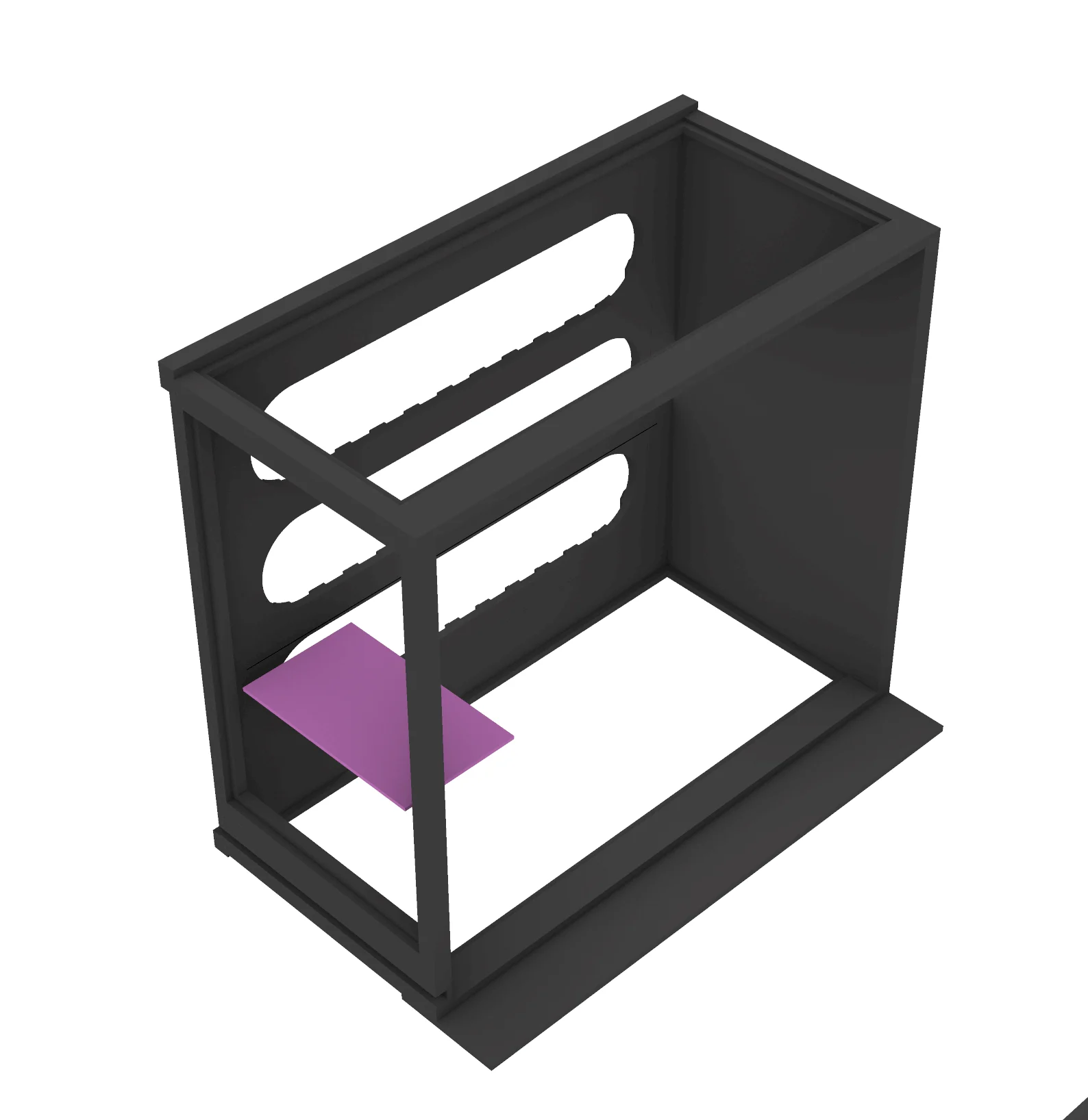
The digital model is broken into its constituent layers: roof, walls, frame, interior fittings and smaller objects. The exploded view makes those relationships visible and allows the project to be understood as an assembly rather than only a finished exterior image.
The archive also records preparation of separate wall, ceiling, attachment and furniture parts for model making. That progression from sketches to three-dimensional parts is central to the project. The work presented here remains a spatial concept and model-development study.
Corrugated enclosure
The familiar container surface remains a visible part of the project’s character.
A second volume
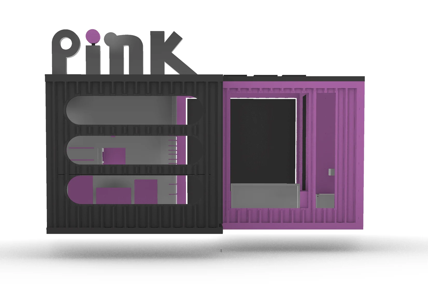
The black extension introduces a contrasting structure and large rounded openings.
Fitted elements
Furniture and storage are developed as parts of the overall compact spatial arrangement.
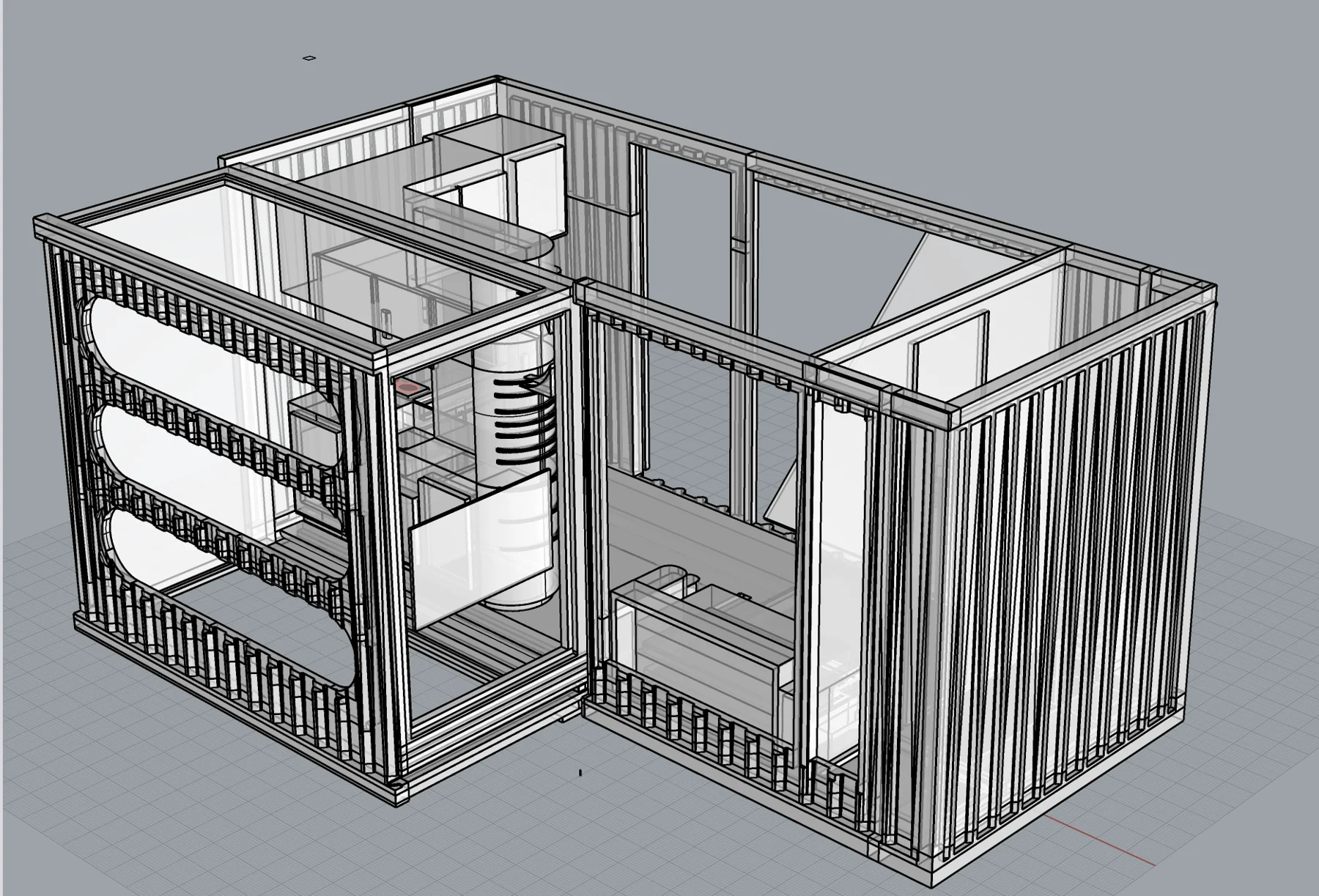
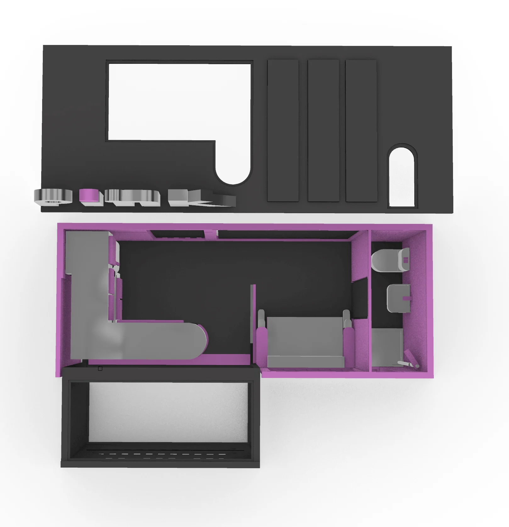
The shell
has a voice.
A rear view of the digital model brings the corrugated surface, pink enclosure and black frame into focus.
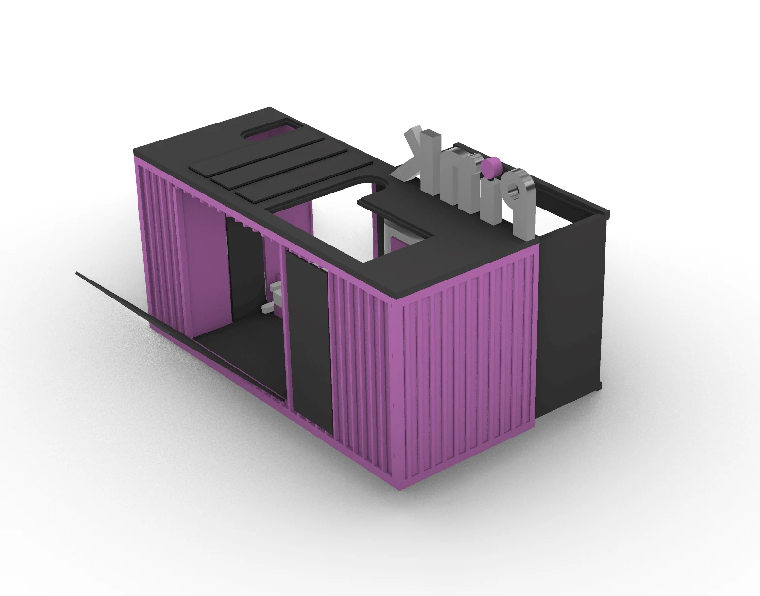
A studio at
the edge of
the city.
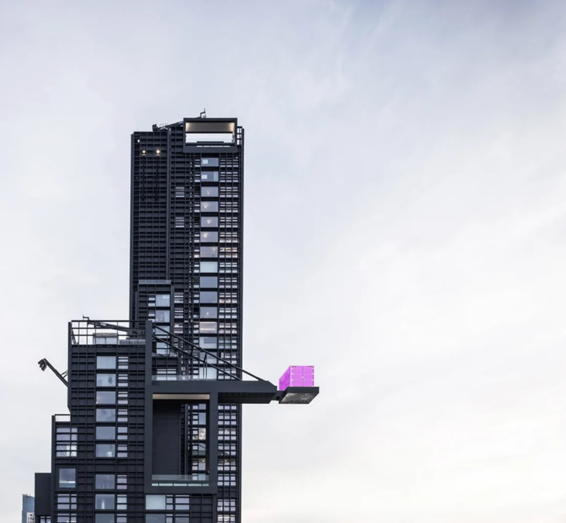
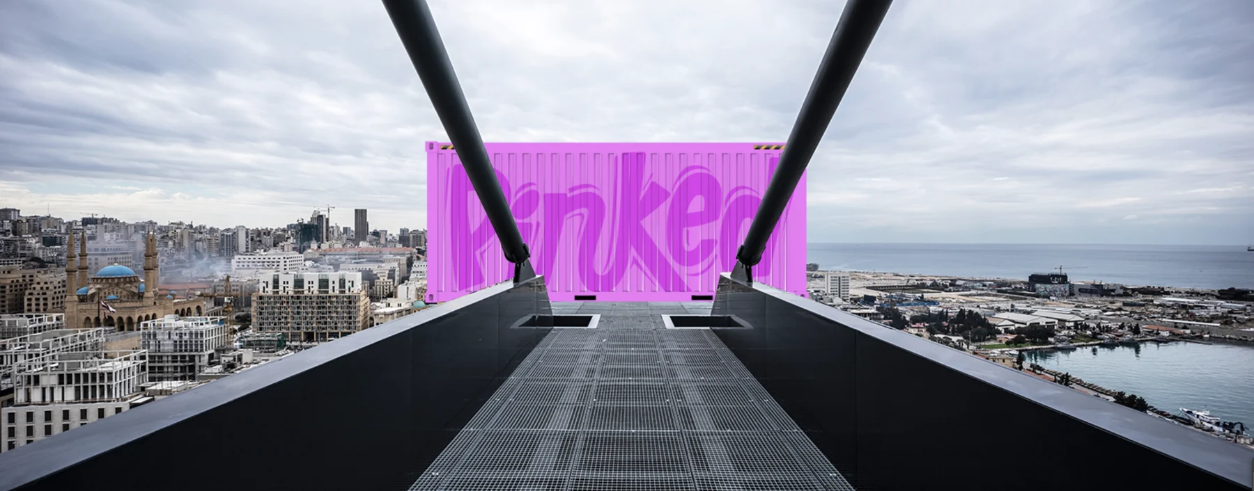
The project’s scenario images place the studio beyond a tower facade, reached by a projecting walkway. That setting turns arrival into part of the spatial narrative: a route out toward a compact, distinctly colored destination, with the city and waterfront beyond it.
These are contextual photomontages used to explore the experience and presence of the proposal. They show a possible relationship to an urban building, rather than documenting an installed project. The contrast between the dark host structure and the pink studio is the central visual gesture.
Industrial shell.
Expressive
interior.
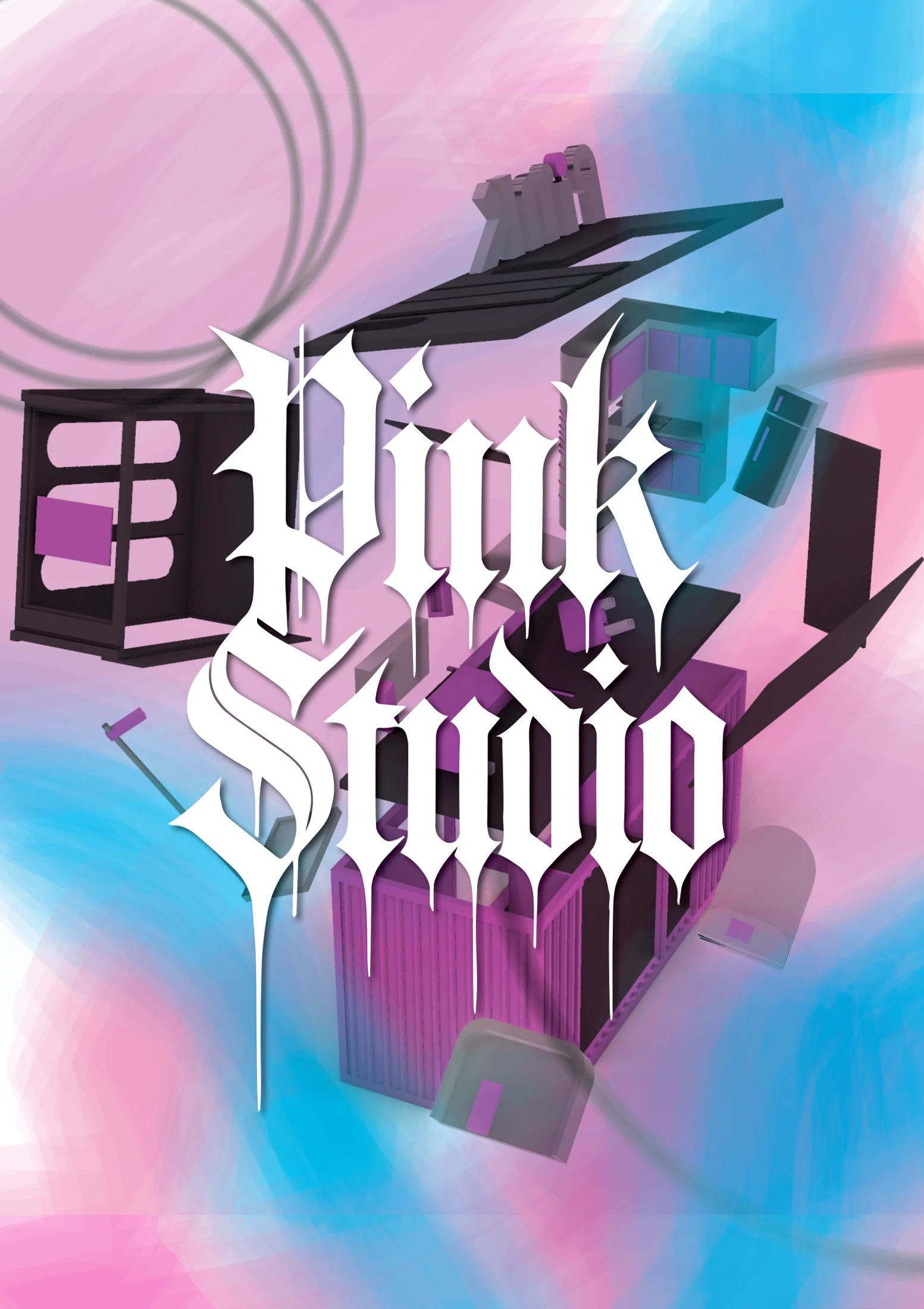
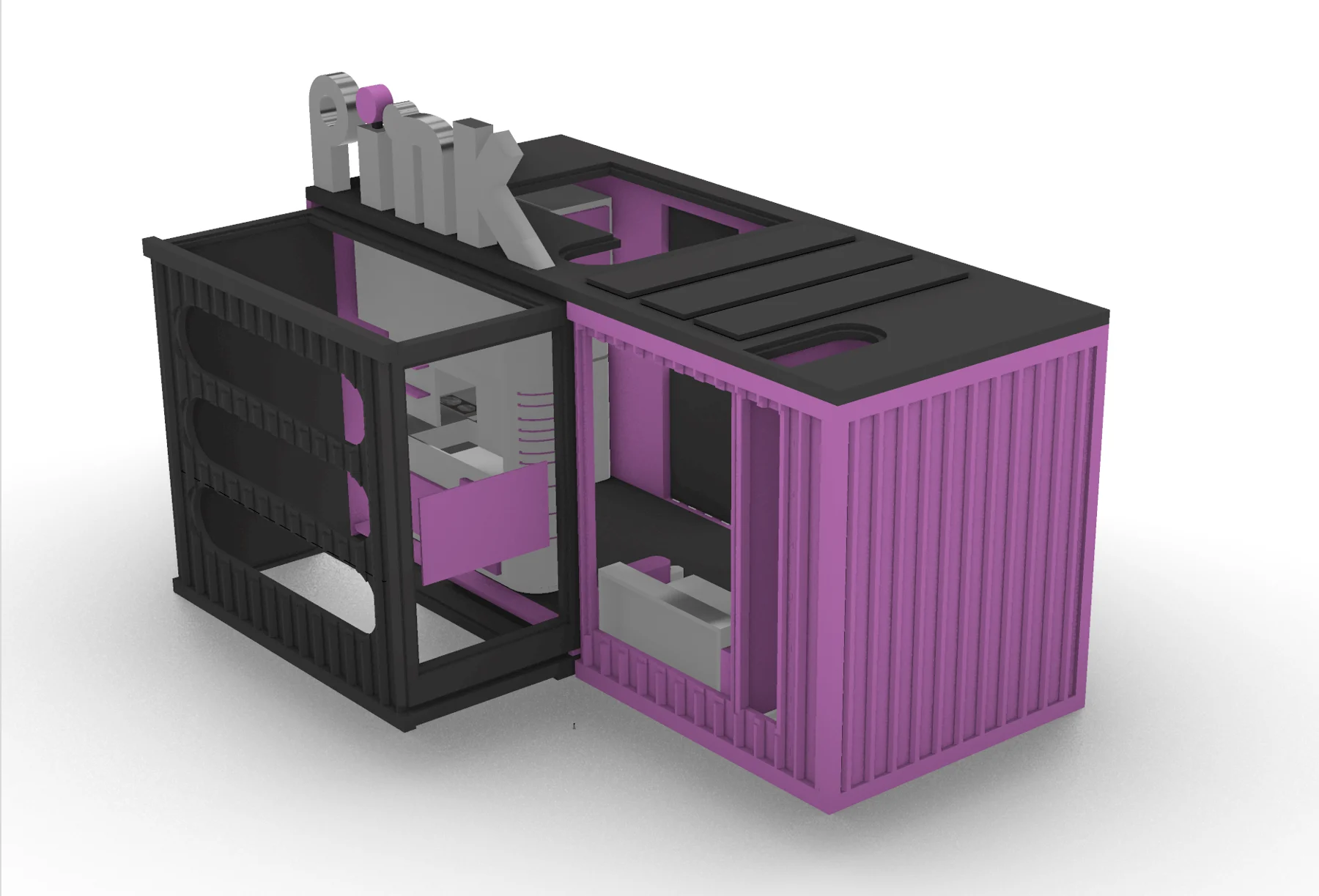
The final images bring the project’s parts into one recognizable object. Pink corrugated walls meet dark frames, a graphic roof sign and an interior developed at furniture scale. The presentation poster pushes that contrast further, combining the exploded spatial model with vivid pink and blue and a blackletter studio title.
The result is a study in how a small working environment can carry a strong identity, from the layout and assembly to the view from outside. The container is both a spatial constraint and the surface on which that identity is built.