HUNNY
One golden story.
Two very different rituals.
HUNNY is the warmth of the family table: local farmers, honest honey, one generous spoonful. Yeah Hunny is its mischievous alter ego. Same golden ingredient. A very different kind of invitation.
Begin with
the beekeeper.
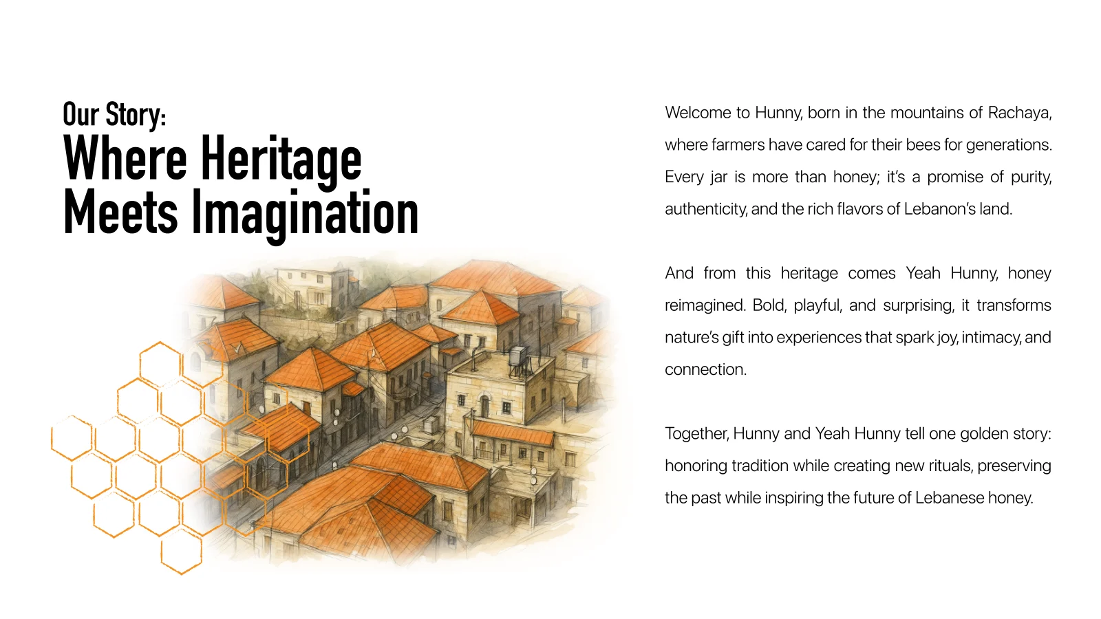
The project began with a question of value. The research deck describes Rachaya’s beekeepers producing distinctive local honey, while bulk selling and reliance on intermediaries leave their work without a strong identity of its own. The design brief was to give that honey a recognizable name, a coherent family of products, and a story that could travel beyond the village.
The consumer study focused on people who value origin and tradition but struggle to judge what is authentic on a crowded shelf. Trust, clarity and direct connection to the producer became the starting points for the brand. The ambition was a cooperative voice for the farmers, expressed through packaging and communication.
One sweet soul.
Two alter egos.
by nature.
Pure by Nature,
True by Tradition.
Not innocent.
A little honey.
A little trouble.
HUNNY
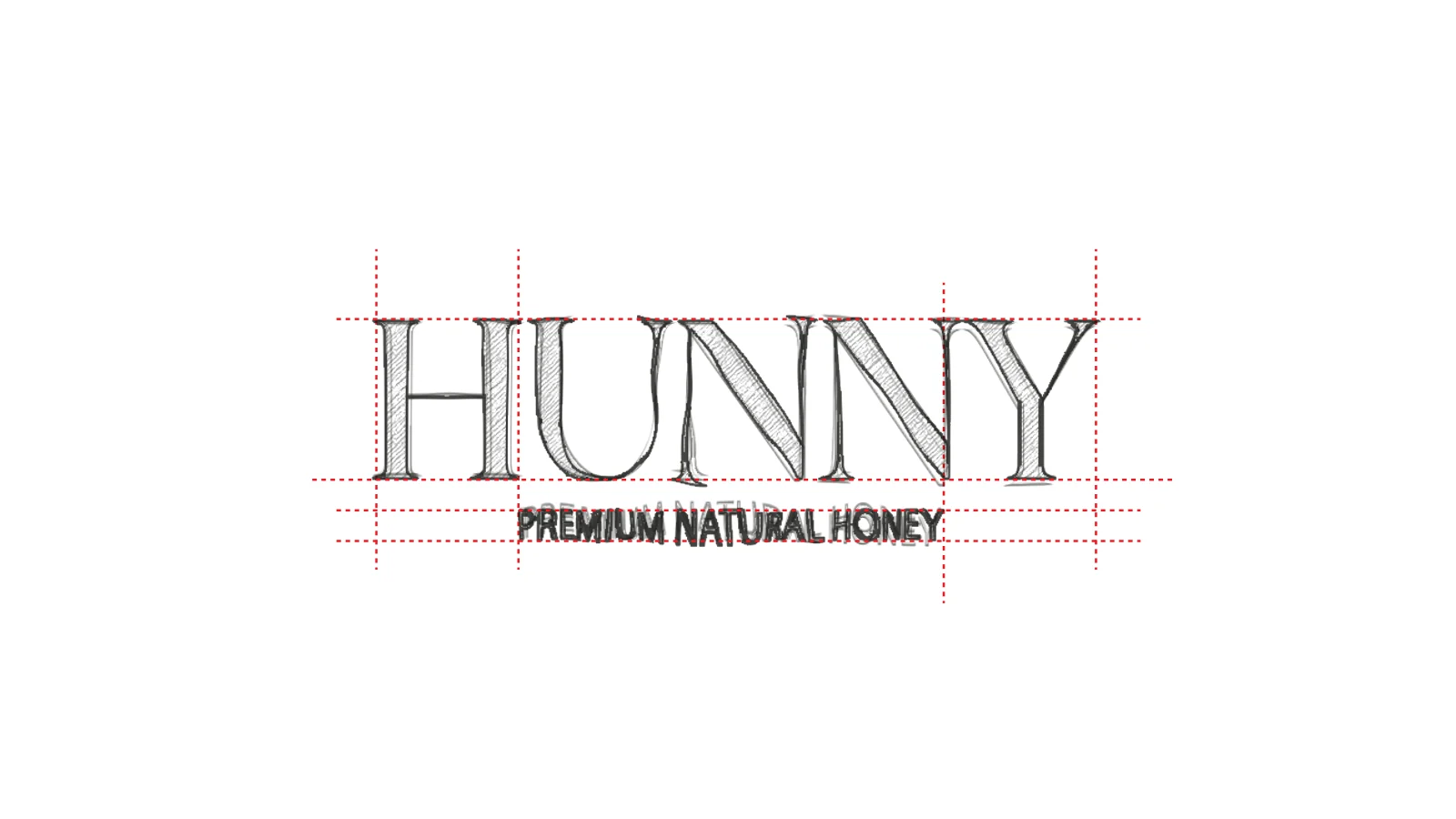
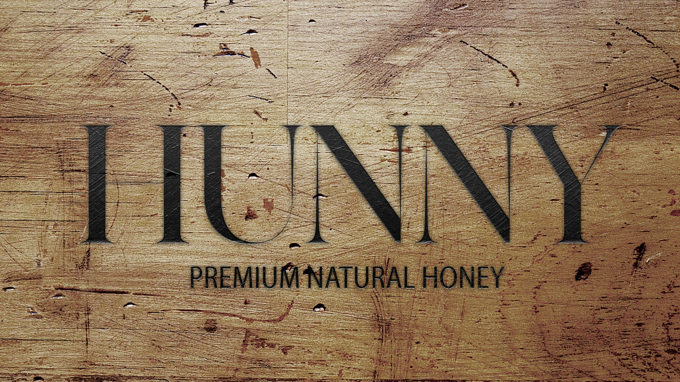
Pure by Nature, True by Tradition.The parent brand presents natural honey through a restrained serif wordmark. Fine strokes, balanced proportions and the direct “Premium Natural Honey” descriptor build an identity around purity and provenance. The tone is warm, assured and grounded in the land: the local farmer, the family table, the simple pleasure of a spoonful of honest honey.
Yeah Hunny
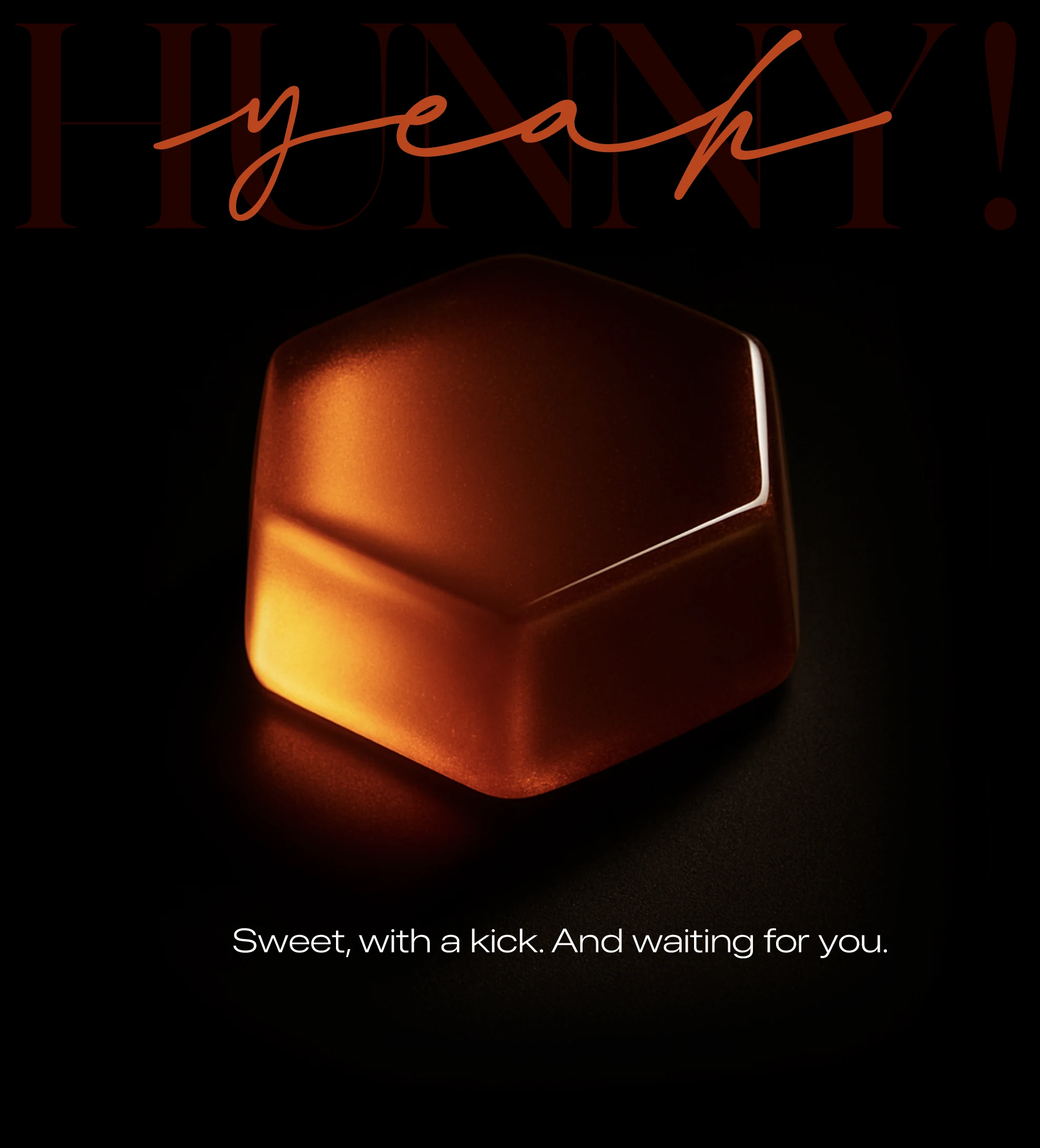
Sweet. Not innocent.The alter ego keeps the parent’s serif foundation, then interrupts it with a handwritten gesture. This is the mischievous side of the family: grown-up humor, a little innuendo and a deliberately intimate invitation. Honey becomes a candy to share, a playlist to press play on, and an excuse to linger.
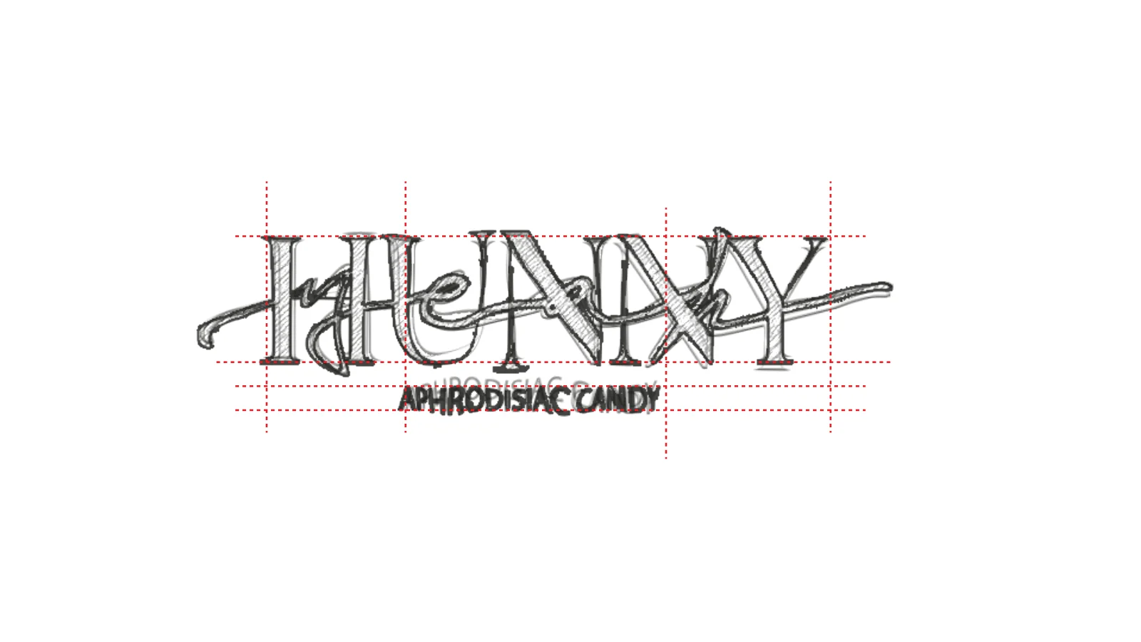
A mark you
can almost feel.
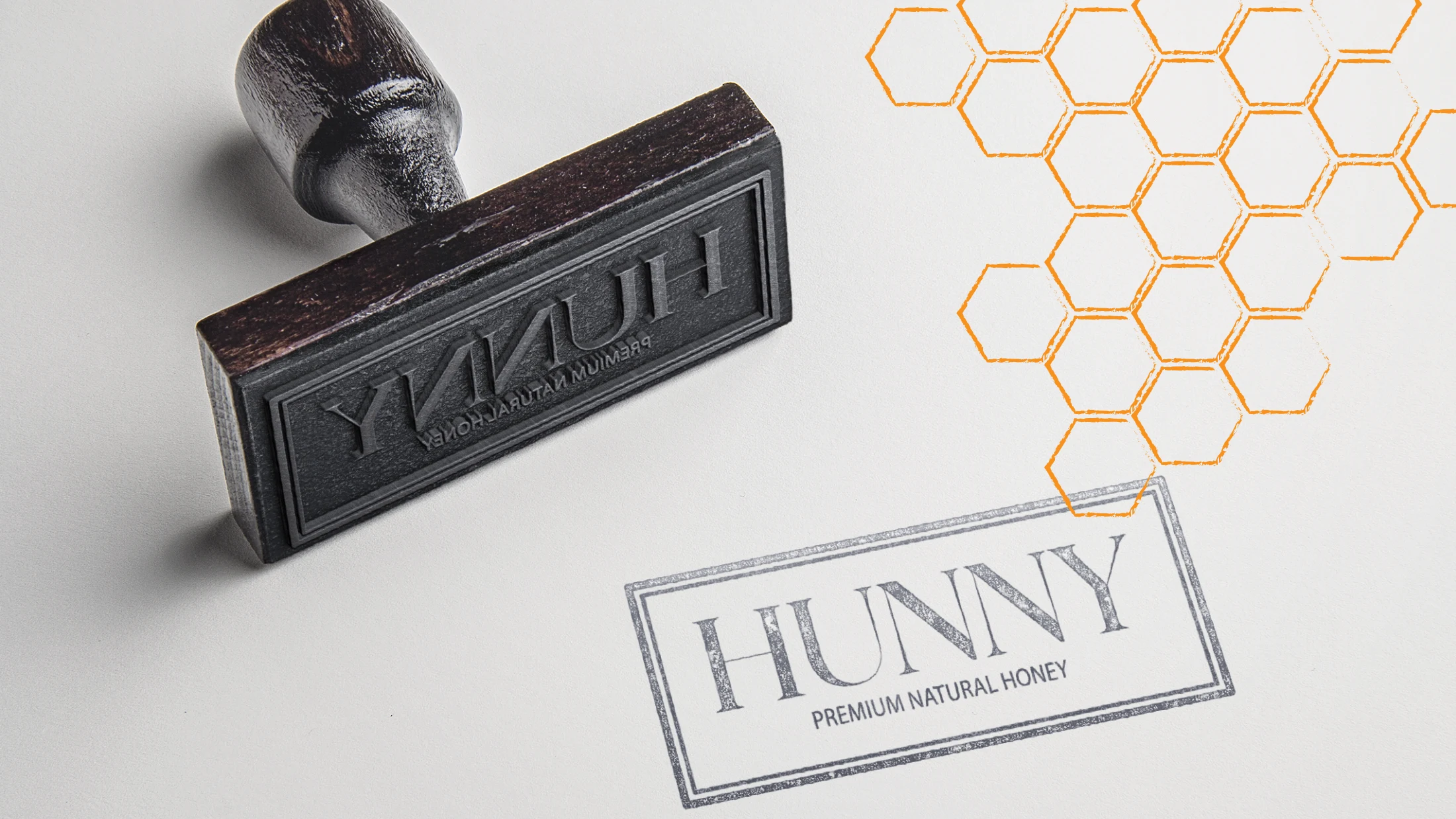
The wordmark moves from the page into grain, ink and texture. Two application studies from the original identity book.
The colors
of Rachaya.
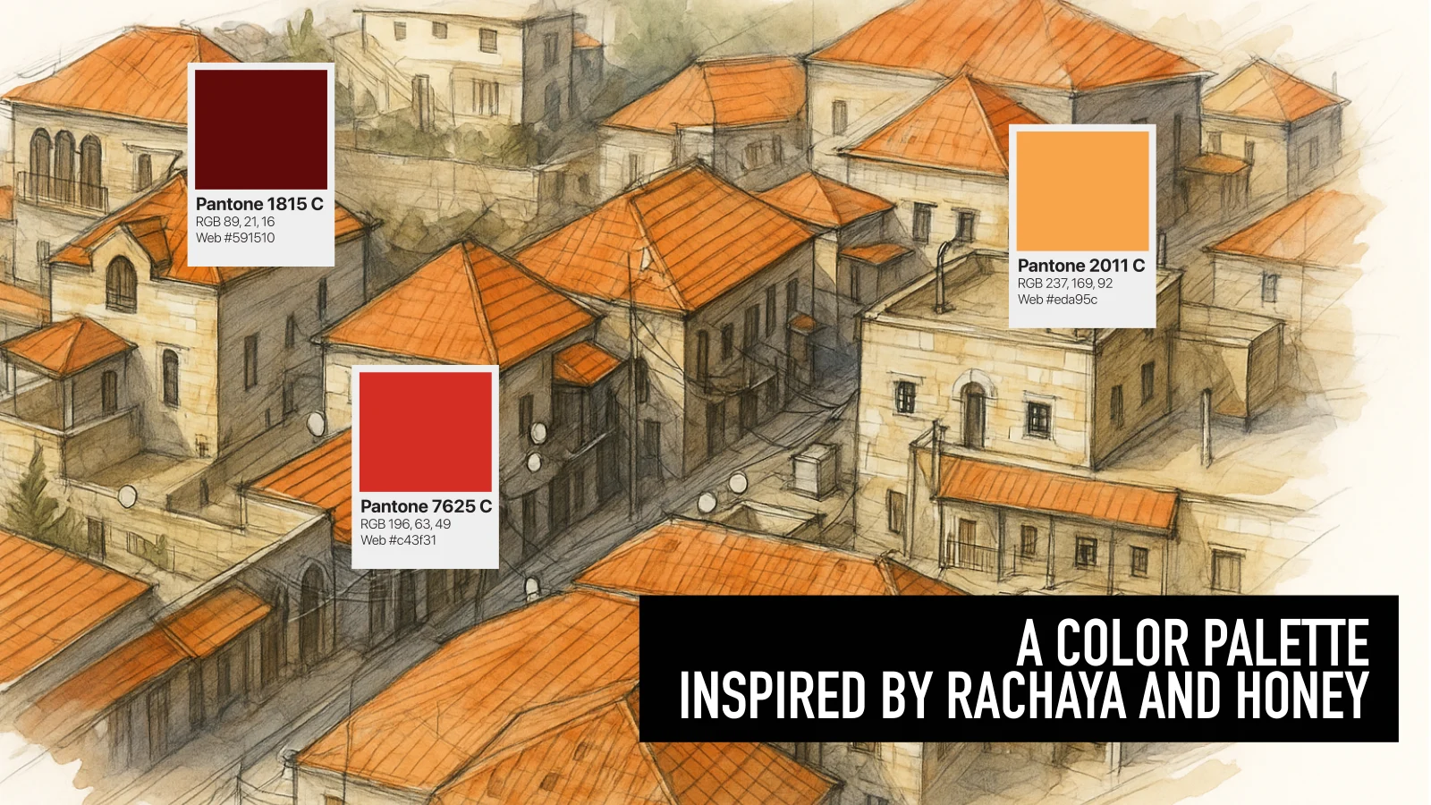
The palette brings together the depth of dark honey, the warmth of amber and the red tones of the village. The brand guidelines specify burgundy, terracotta red and golden apricot. These colors move across labels, packaging and campaign imagery, creating a shared family even when the products speak differently.
The final system pairs the delicate wordmark with a much more direct condensed heading style and simple supporting text. In the brand book, honeycomb geometry and images of the landscape supply a second layer of recognition.
Apricot
#EDA95C / Golden warmth
Terracotta
#C43F31 / Village and earth
Burgundy
#591510 / Depth and contrast
A small collection
of a place.
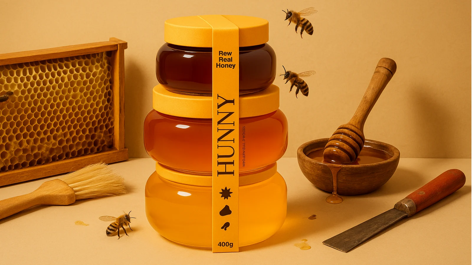
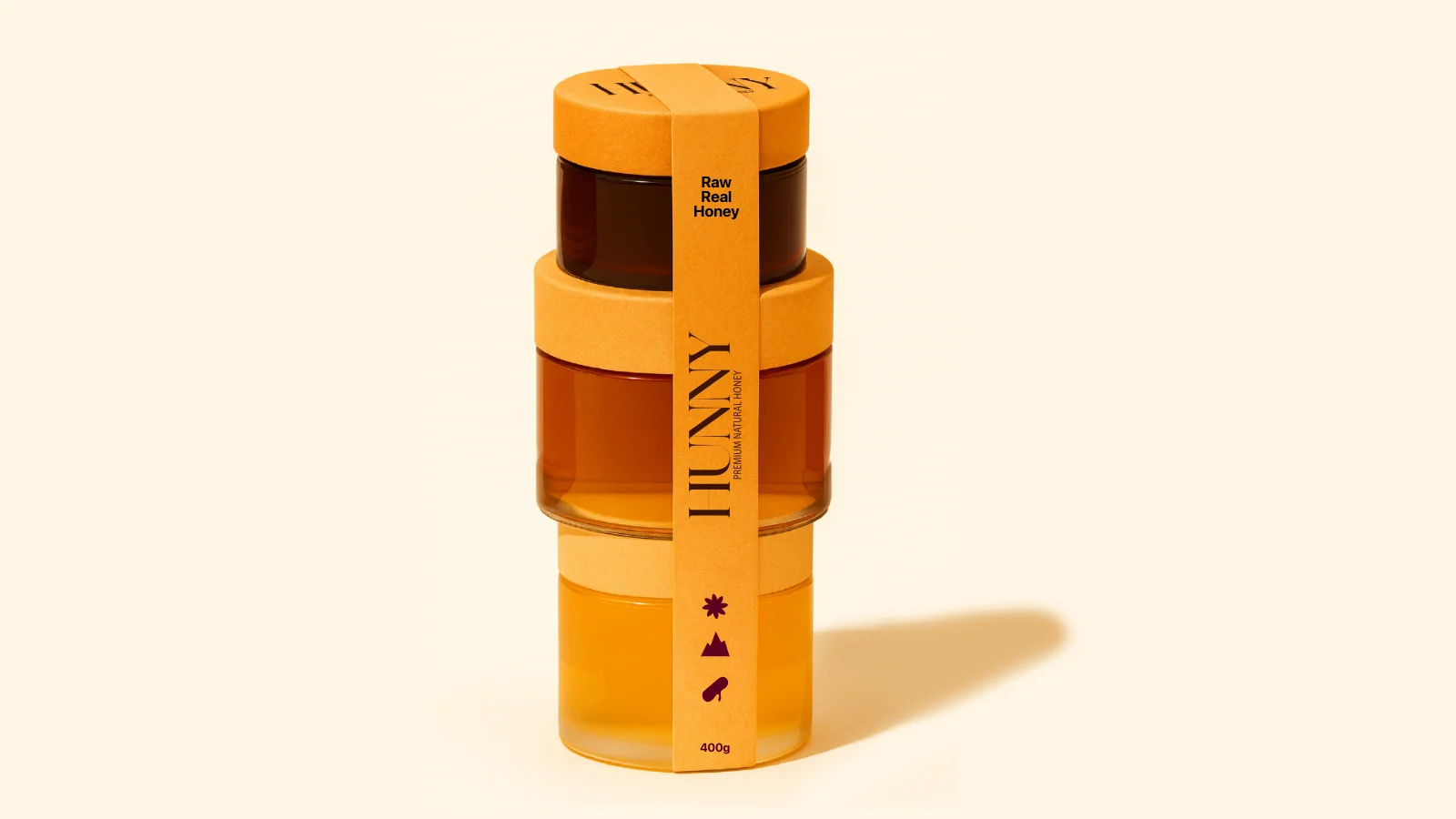
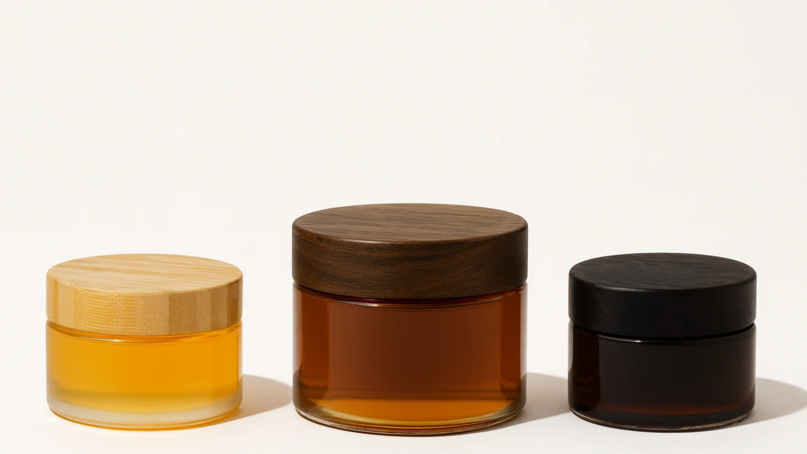
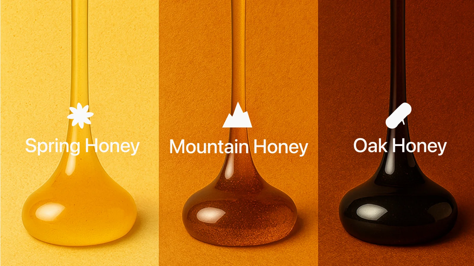
Spring, mountain and oak honey become a single tasting family. The proposed set combines a 100 g spring jar, a 200 g mountain jar and a 100 g oak jar. Different sizes and honey colors are part of the composition; the connecting sleeve turns the individual jars into one vertical object.
The packaging study looks at the whole assembly: containers, lids, staining, stickers and the sleeve. The final visualization keeps the information on a narrow band so the honey itself remains visible. A set designed to be given, opened and kept on display.
Same honey.
Different
intentions.
HUNNY belongs at the family table.
Yeah Hunny stays a little later.
Make a night
of it.
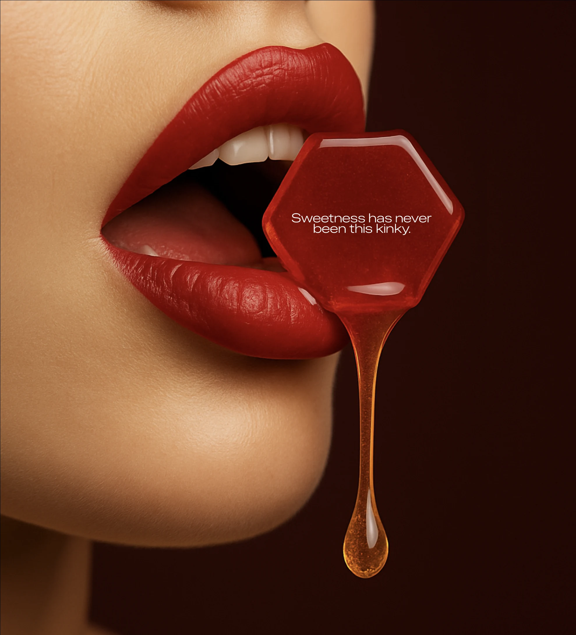
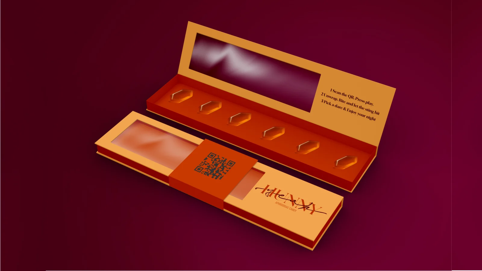
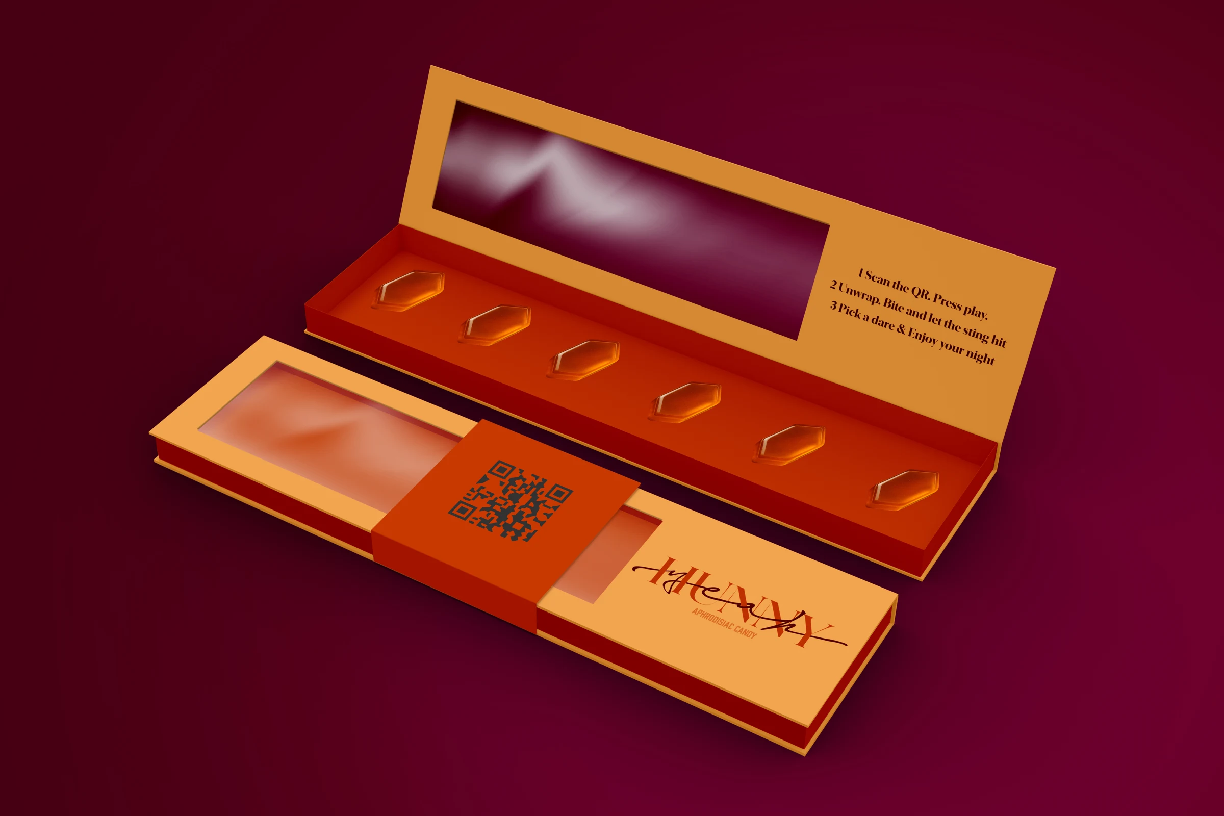
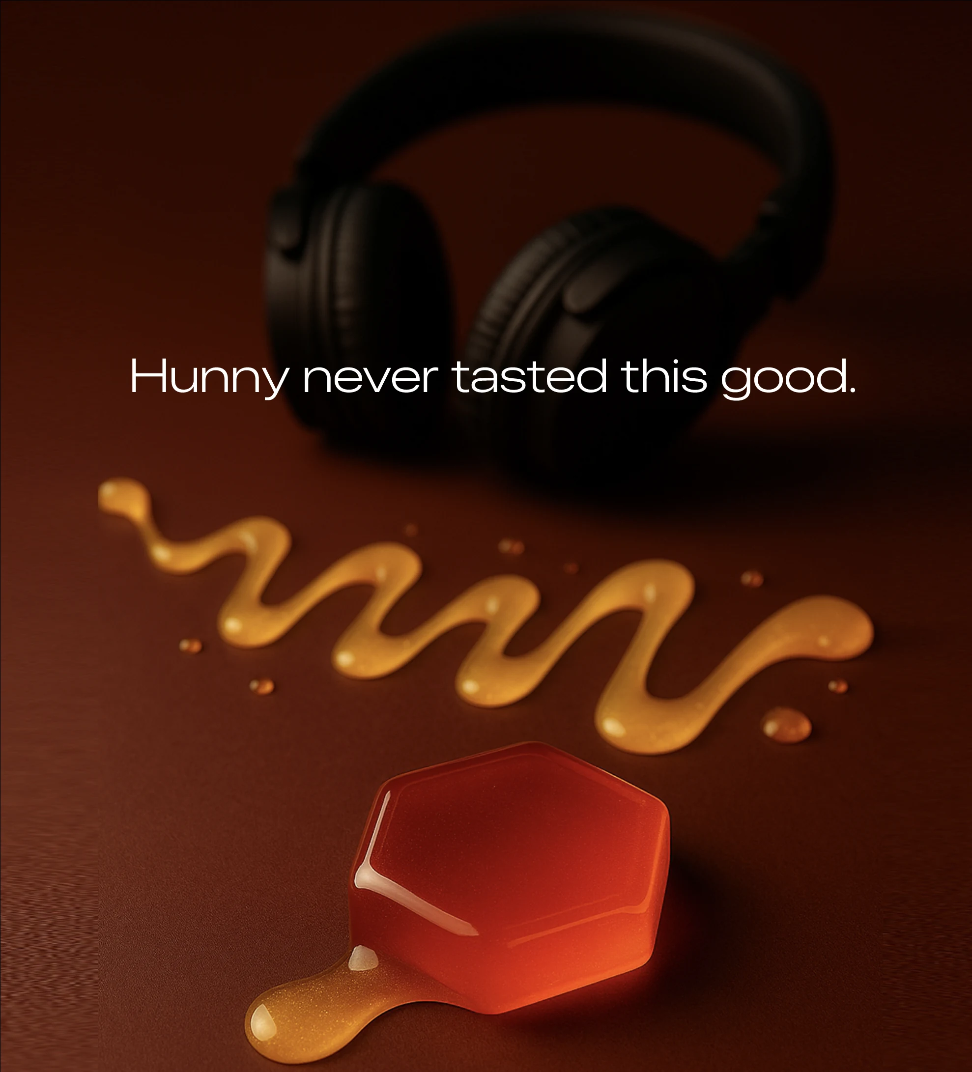
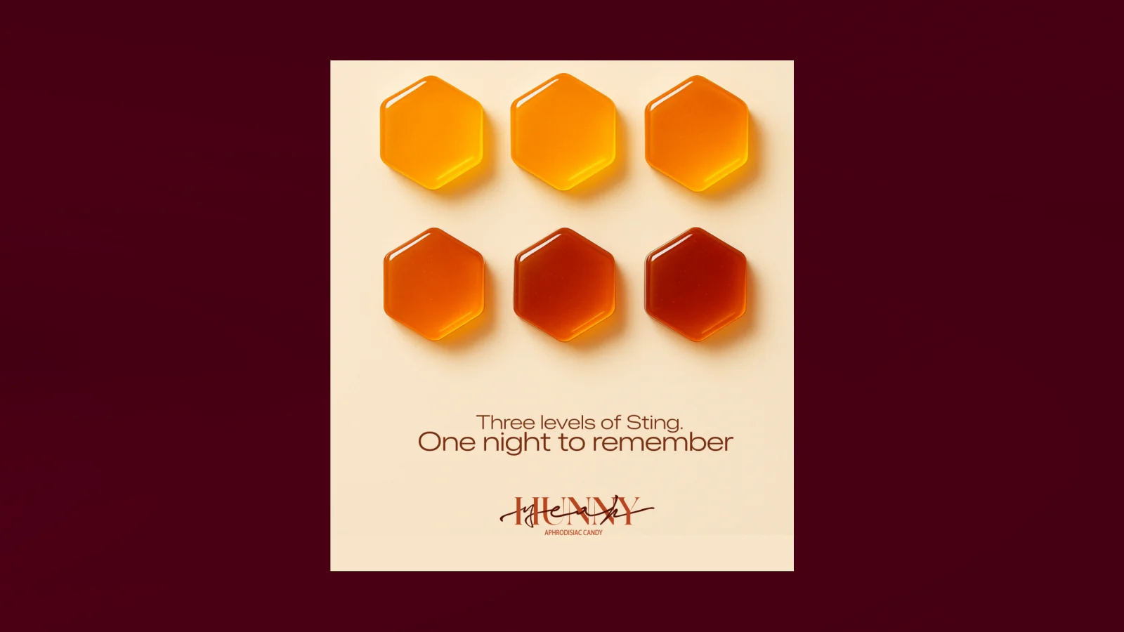
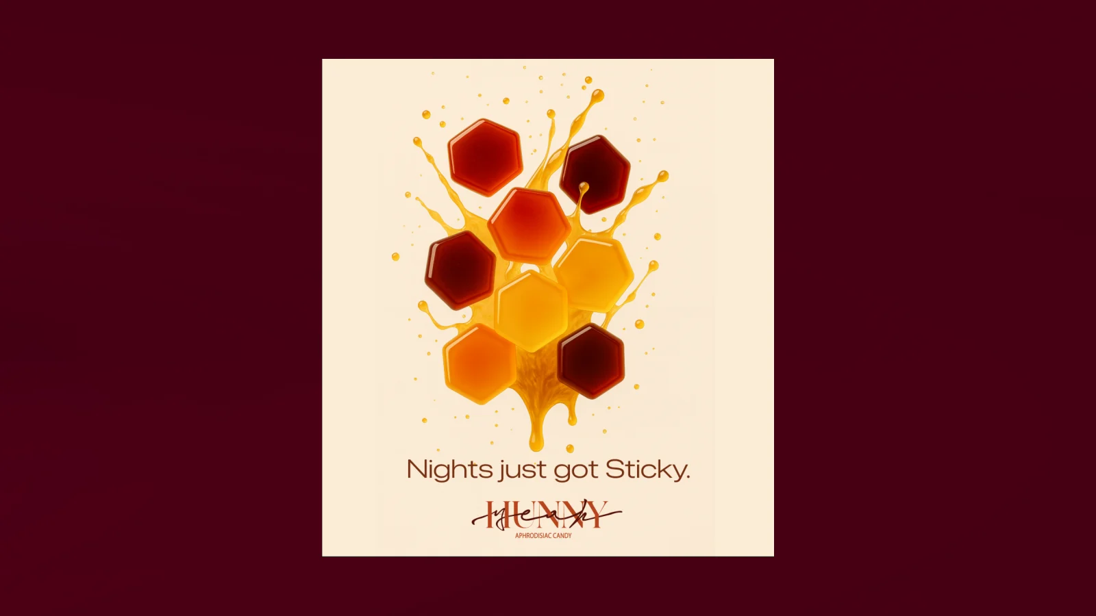
The innocent spoonful gets a mischievous second life. The second product takes the honeycomb as its shape. Hexagonal honey candies sit in a long presentation box, with a deliberately intimate, playful tone. The proposal explores ginger, ginseng and maca as part of the candy concept; its positioning in the original presentation is an aphrodisiac experience.
That positioning is treated here as the brand concept, rather than a claim of tested effects. The design work concentrates on the box, the arrangement of the pieces, the visual language and a playlist accessed through the packaging. The package creates a sequence: open, discover, share.
Good things
come undone.
A sleeve slips off. A playlist starts. The evening takes its time.
Let the honey
do the flirting.
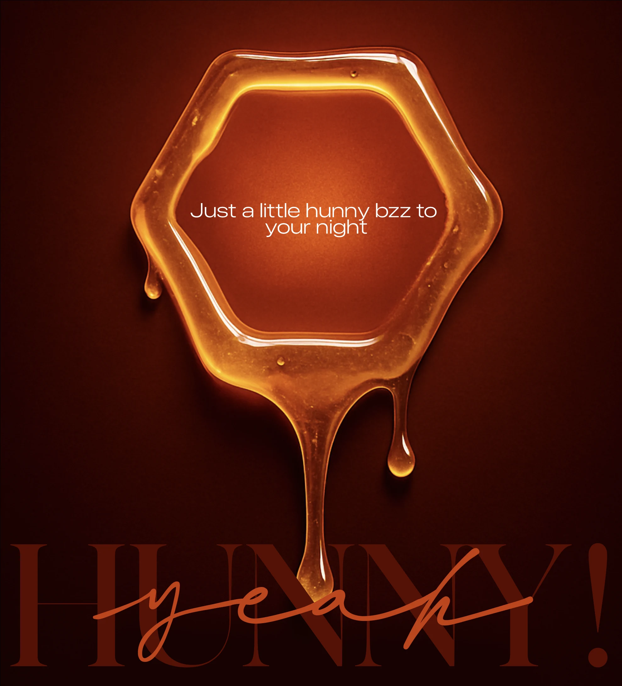
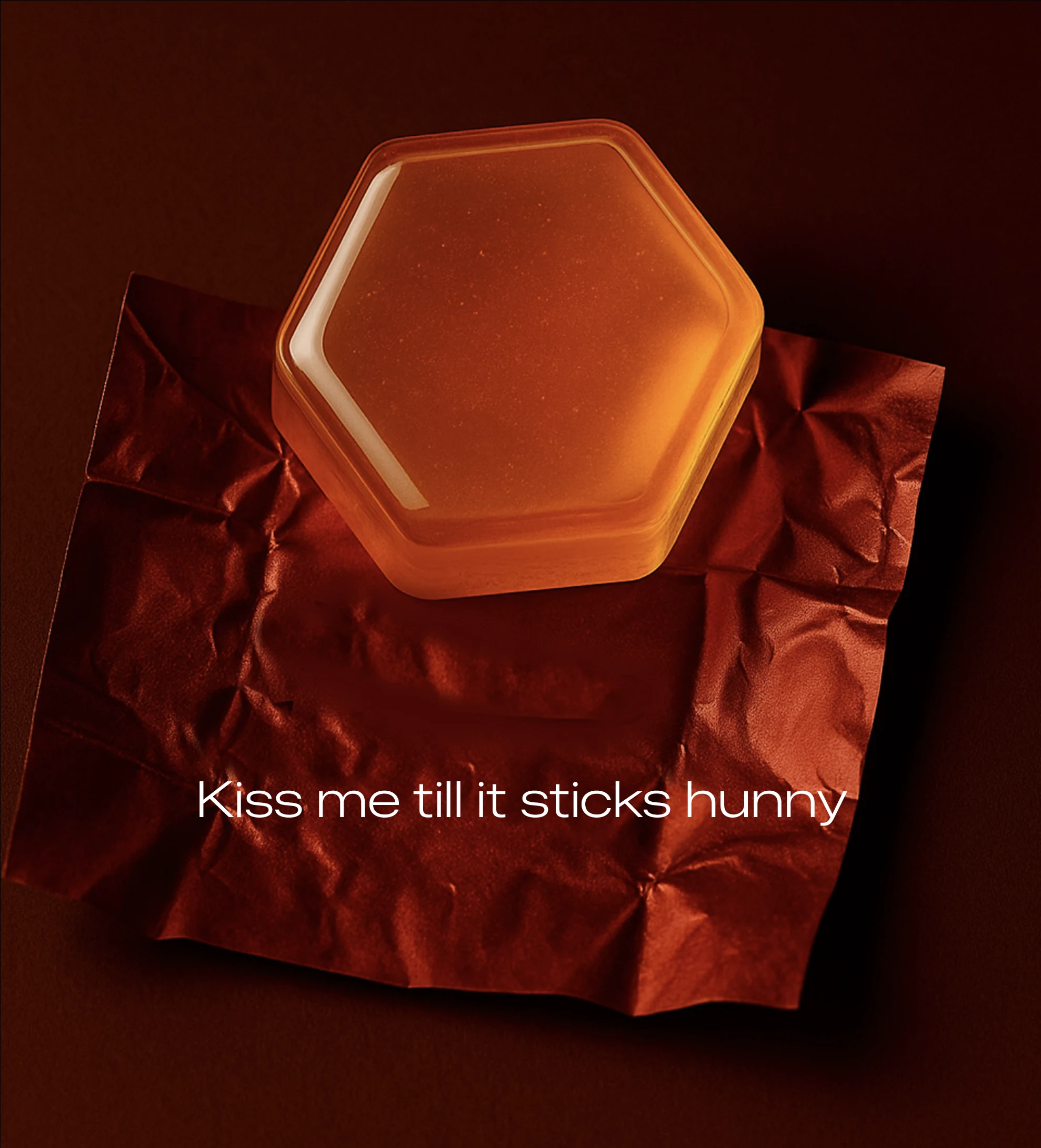
Dark amber. A handwritten interruption. A teasing line. The original campaign gives the alter ego its own unmistakable voice.
From a shelf
to a feed.
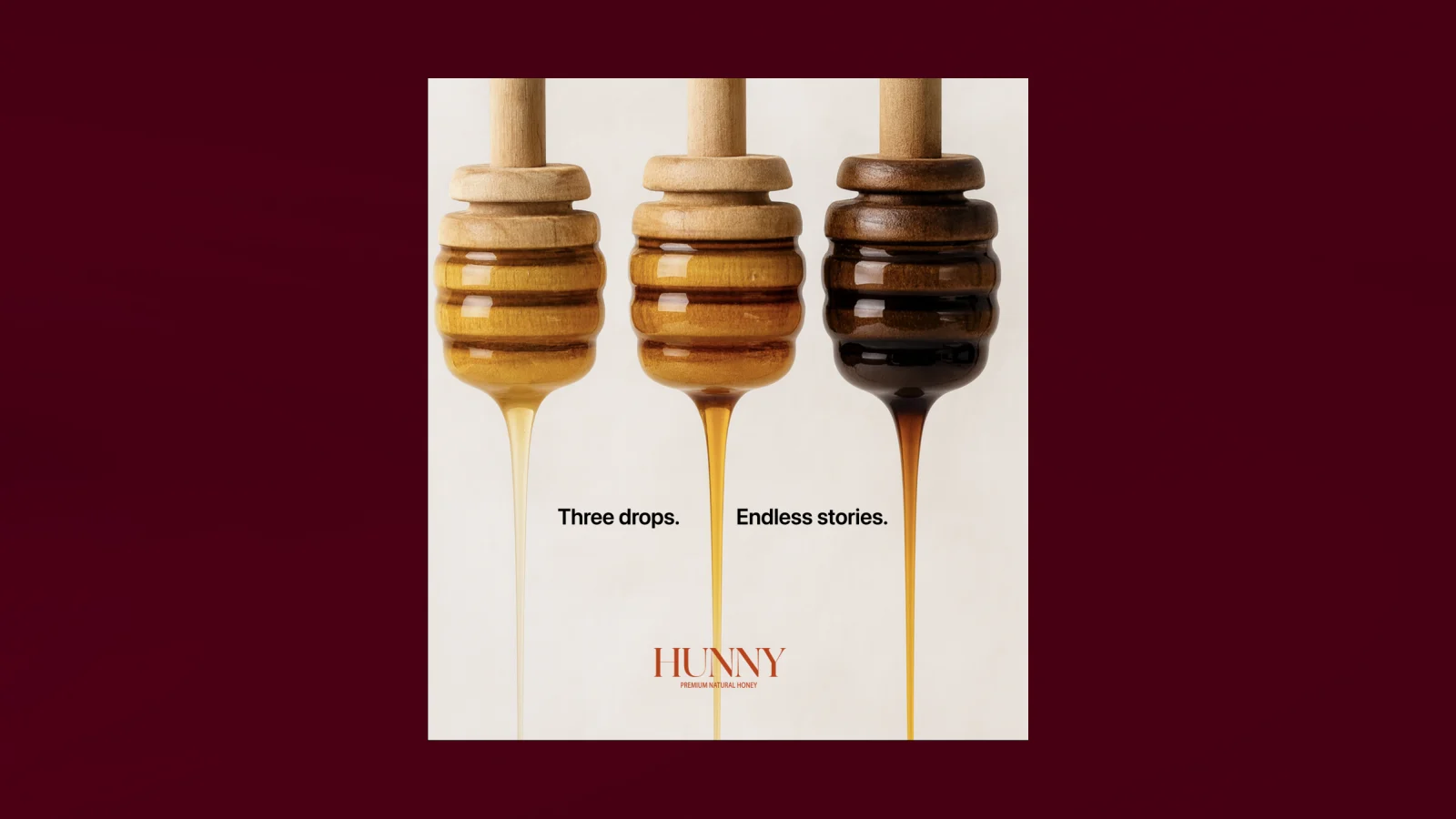
The campaign carries the same ingredients into communication: honey dippers, visible viscosity, color gradients and hexagons. HUNNY’s images celebrate the range and provenance of the honey. Yeah Hunny turns the lights down: deeper colors, close crops, teasing lines and honeycomb forms that invite a second look.
The project includes a brand book, packaging visualizations, social campaign proposals and an outline for a three-month introduction. Identity, sample development, an online presence and a discovery drop are presented as stages in that plan. They are the proposed route to market, not evidence of a completed launch.
Build a shared identity
Develop product samples
Create the online presence
Introduce a discovery drop